Logo... and page design.

Boosters, OK, I put together a new logo. I'm not going to say much about it because if I do it will likely skew perceptions. I will say that it comes in a variety of forms to accommodate the context: http://redshift-software.com/~grafik/boost/logo.htm Boost Logo And more changes to the front page: http://redshift-software.com/~grafik/boost/index.htm Boost C++ Libraries PS.. It looks like the logo page requires a conforming CSS1 browser :-\ So please use something other than IE ;-) -- -- Grafik - Don't Assume Anything -- Redshift Software, Inc. - http://redshift-software.com -- rrivera/acm.org - grafik/redshift-software.com - 102708583/icq

On Mon, 22 Nov 2004 01:18:18 -0600, Rene Rivera wrote
And more changes to the front page:
http://redshift-software.com/~grafik/boost/index.htm Boost C++ Libraries
This one is nice, although I agree with Dave and like Daniel's as well. Any response to my thought of moving the search to the top right of the page? Jeff

"Jeff Garland" <jeff@crystalclearsoftware.com> writes:
On Mon, 22 Nov 2004 01:18:18 -0600, Rene Rivera wrote
And more changes to the front page:
http://redshift-software.com/~grafik/boost/index.htm Boost C++ Libraries
This one is nice, although I agree with Dave and like Daniel's as well.
I still agree with Dave too ;-)
Any response to my thought of moving the search to the top right of the page?
I like the idea. We need to make sure we can drop or shrink the Google logo. I don't recall any rules that say we can't, but we ought to be sure. -- Dave Abrahams Boost Consulting http://www.boost-consulting.com
Jeff Garland wrote:
On Mon, 22 Nov 2004 01:18:18 -0600, Rene Rivera wrote
And more changes to the front page:
http://redshift-software.com/~grafik/boost/index.htm Boost C++ Libraries
This one is nice, although I agree with Dave and like Daniel's as well.
OK... more changes. Closer to the original.
Any response to my thought of moving the search to the top right of the page?
I'll try and do something with the existing logo (re; Dave's point about google rules and such). -- -- Grafik - Don't Assume Anything -- Redshift Software, Inc. - http://redshift-software.com -- rrivera/acm.org - grafik/redshift-software.com - 102708583/icq
David Abrahams wrote:
Rene Rivera <grafik.list <at> redshift-software.com> writes:
I'll try and do something with the existing logo (re; Dave's point about google rules and such).
Keep in mind that I have no idea what those rules are, if any.
Yes, noted. I was expecting you to look them up, and tell us about them ;-) -- -- Grafik - Don't Assume Anything -- Redshift Software, Inc. - http://redshift-software.com -- rrivera/acm.org - grafik/redshift-software.com - 102708583/icq
Rene Rivera <grafik.list@redshift-software.com> writes:
David Abrahams wrote:
Rene Rivera <grafik.list <at> redshift-software.com> writes:
I'll try and do something with the existing logo (re; Dave's point about google rules and such). Keep in mind that I have no idea what those rules are, if any.
Yes, noted.
I was expecting you to look them up, and tell us about them ;-)
Not gonna, sorry. -- Dave Abrahams Boost Consulting http://www.boost-consulting.com

Rene Rivera wrote:
[...] I was expecting you to look them up, and tell us about them ;-)
http://www.google.com/permissions/guidelines.html http://www.google.com/stickers.html http://www.google.com/permissions/request.html The stupid thing is that Google's legal team has prepared a very thorough document on how to use the Goole trademark, and their own website does not respect the guidelines!!! Oh well. That's law for ya. Dave
David B. Held wrote:
Rene Rivera wrote:
[...] I was expecting you to look them up, and tell us about them ;-)
http://www.google.com/permissions/guidelines.html http://www.google.com/stickers.html http://www.google.com/permissions/request.html
Forgot to say... thanks for finding the info! -- -- Grafik - Don't Assume Anything -- Redshift Software, Inc. - http://redshift-software.com -- rrivera/acm.org - grafik/redshift-software.com - 102708583/icq

On Mon, Nov 22, 2004 at 06:36:54PM +0000, David Abrahams wrote:
Rene Rivera <grafik.list <at> redshift-software.com> writes:
I'll try and do something with the existing logo (re; Dave's point about google rules and such).
Keep in mind that I have no idea what those rules are, if any.
Fact is, Google just rules. If you use it, be so fair to show that. -- Carlo Wood <carlo@alinoe.com>

On Tue, 23 Nov 2004 01:44:38 +0100, Carlo Wood <carlo@alinoe.com> wrote:
On Mon, Nov 22, 2004 at 06:36:54PM +0000, David Abrahams wrote:
Rene Rivera <grafik.list <at> redshift-software.com> writes:
I'll try and do something with the existing logo (re; Dave's point about google rules and such).
Keep in mind that I have no idea what those rules are, if any.
Fact is, Google just rules. If you use it, be so fair to show that.
I don't think anyone ever suggested removing the Google logo, only making it smaller. -- Caleb Epstein caleb dot epstein at gmail dot com

At 10:41 22/11/2004, you wrote:
On Mon, 22 Nov 2004 01:18:18 -0600, Rene Rivera wrote
And more changes to the front page:
http://redshift-software.com/~grafik/boost/index.htm Boost C++ Libraries
This one is nice, although I agree with Dave and like Daniel's as well.
I agree.. tho every page I've seen I feel there perhaps should be be a 1/2 line vertical spacing between the major list items (eg between each library in the "updated libraries section).. I wouldn't say its cluttered, but it to me it emphasise the grouping.
Any response to my thought of moving the search to the top right of the page?
Jeff _______________________________________________ Unsubscribe & other changes: http://lists.boost.org/mailman/listinfo.cgi/boost
--- Incoming mail is certified Virus Free. Checked by AVG anti-virus system (http://www.grisoft.com). Version: 6.0.788 / Virus Database: 533 - Release Date: 01/11/2004
--- Outgoing mail is certified Virus Free. Checked by AVG anti-virus system (http://www.grisoft.com). Version: 6.0.788 / Virus Database: 533 - Release Date: 01/11/2004
Mark Blewett wrote:
I agree.. tho every page I've seen I feel there perhaps should be be a 1/2 line vertical spacing between the major list items (eg between each library in the "updated libraries section).. I wouldn't say its cluttered, but it to me it emphasise the grouping.
There's already a extra 1/4 line gap there (plus the v-line space).. making it larger will mean making the rest of the gaps larger, to compensate. I'll see what I can do. -- -- Grafik - Don't Assume Anything -- Redshift Software, Inc. - http://redshift-software.com -- rrivera/acm.org - grafik/redshift-software.com - 102708583/icq

Rene Rivera wrote:
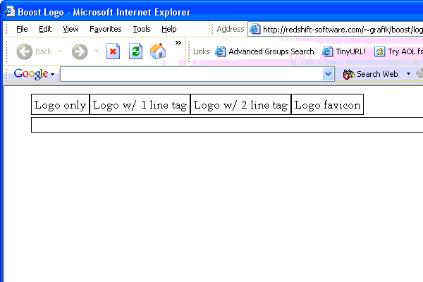
http://redshift-software.com/~grafik/boost/logo.htm Boost Logo
I like this one http://redshift-software.com/~grafik/boost/more/logo-2line.png
I like it. Assuming there will be some logo in the top left corner B.
Bronek Kozicki wrote:
Rene Rivera wrote:
I like it. Assuming there will be some logo in the top left corner
Yes, I took the logo out while that gets worked out separately. -- -- Grafik - Don't Assume Anything -- Redshift Software, Inc. - http://redshift-software.com -- rrivera/acm.org - grafik/redshift-software.com - 102708583/icq
Rene Rivera <grafik.list@redshift-software.com> writes:
http://redshift-software.com/~grafik/boost/logo.htm Boost Logo
All I see there is: And there are no clickable links. But if I go to http://redshift-software.com/~grafik/boost/more/ I can browse what I presume you've done there. I'm not fond of any of these. They're all still trying to do too much, IMO. Too many fonts, and too many design elements that don't make sense to me. For example, what's the point of the circle around the angle brackets? And why do they poke through the sides of the circle? In my suggestion boost/ C++ The slash followed boost and boost was lowercased because it corresponds to what we write when we #include boost headers. If you're going to upcase boost and move the slash, the slash may as well be dropped. Putting C++ in typewriter font doesn't make any sense to me either. We never write that in our programs. Do you regularly increment variables named capital `C'? Logo design is really, really hard. But if you take a look at the really effective ones (Apple, FedEx**, Coke, UPS, ...) they do basically one simple thing. It's much better to err on the side of minimalism. (**) FedEx is really subtle. See the arrow? Here's an attempt to add interest to my previous logo. I have really poor image editing tools, so I couldn't do a great job with it, but maybe you get the idea. -- Dave Abrahams Boost Consulting http://www.boost-consulting.com
David Abrahams wrote:
Rene Rivera <grafik.list@redshift-software.com> writes:
http://redshift-software.com/~grafik/boost/logo.htm Boost Logo
All I see there is:
I did mention that it would not work in IE :-\
And there are no clickable links. But if I go to http://redshift-software.com/~grafik/boost/more/ I can browse what I presume you've done there.
Yes that's it.
I'm not fond of any of these. They're all still trying to do too much, IMO. Too many fonts, and too many design elements that don't make sense to me. For example, what's the point of the circle around the angle brackets? And why do they poke through the sides of the circle?
The bare logo is just that, the logo. The text "Boost/C++" is the tag line and only embellishes the actual logo. Anyway.. I personally think that the "/C++" part isn't meaningful. Truthfully I put it in per your suggestion. Like the logo Joaquin designed what works best is something that has a single iconic logo with the minimum tag line text. Given that, my direction was to use the template "<>" brackets as that is what most closely invokes Boost to me. The circle is a framing container, although breaking at the left and right edges did not come out as well as I intended, it was a mistake to play with the negative space. Another approach I like, which happens to be similar in effect to Joaquin's, is to interleave the <> with each other (see attached).
In my suggestion
boost/ C++
The slash followed boost and boost was lowercased because it corresponds to what we write when we #include boost headers. If you're going to upcase boost and move the slash, the slash may as well be dropped. Putting C++ in typewriter font doesn't make any sense to me either. We never write that in our programs. Do you regularly increment variables named capital `C'?
Dave I think you are falling into the same mental trap you accused me of... You are placing significance on the logo because you have a set idea of what it means.
Logo design is really, really hard.
That it is. And it took me weeks to come up with the one for my company.
But if you take a look at the really effective ones (Apple, FedEx**, Coke, UPS, ...) they do basically one simple thing. It's much better to err on the side of minimalism.
Seen them, studied them... The most effective ones in the long run reduce the textual component to the bare minimum. Here's a guideline,if you can "read" the logo in less than 2 syllables, it's probably too long. -- -- Grafik - Don't Assume Anything -- Redshift Software, Inc. - http://redshift-software.com -- rrivera/acm.org - grafik/redshift-software.com - 102708583/icq
Rene Rivera <grafik.list@redshift-software.com> writes:
In my suggestion boost/ C++ The slash followed boost and boost was lowercased because it corresponds to what we write when we #include boost headers. If you're going to upcase boost and move the slash, the slash may as well be dropped. Putting C++ in typewriter font doesn't make any sense to me either. We never write that in our programs. Do you regularly increment variables named capital `C'?
Dave I think you are falling into the same mental trap you accused me of... You are placing significance on the logo because you have a set idea of what it means.
Did I accuse you of that? I don't know what trap you're saying I'm falling into. You think I shouldn't place significance on the logo? If the logo is insignificant, let's go with the old one. You think I have a set idea of what the logo means? Sorry, I don't see it. Mostly I've been saying, "I don't understand the intention behind many of the design choices you're making." Every time something in a design differs from the rest of the design in some way, it ought to make sense, at least visually. When it doesn't make sense to my eye, I want to know what it's supposed to be doing to my brain that motivated the choice.
Logo design is really, really hard.
That it is. And it took me weeks to come up with the one for my company.
But if you take a look at the really effective ones (Apple, FedEx**, Coke, UPS, ...) they do basically one simple thing. It's much better to err on the side of minimalism.
Seen them, studied them... The most effective ones in the long run reduce the textual component to the bare minimum.
Okay. Not sure how that applies here. Maybe we should drop "C++." :-)
Here's a guideline,if you can "read" the logo in less than 2 syllables, it's probably too long.
You must've meant ``if you can't "read"...'' ?? -- Dave Abrahams Boost Consulting http://www.boost-consulting.com
David Abrahams wrote:
Rene Rivera <grafik.list@redshift-software.com> writes:
Dave I think you are falling into the same mental trap you accused me of... You are placing significance on the logo because you have a set idea of what it means.
Did I accuse you of that?
At least I got that impression in a previous email... Then again it's probably just me :-\
But if you take a look at the really effective ones (Apple, FedEx**, Coke, UPS, ...) they do basically one simple thing. It's much better to err on the side of minimalism.
Seen them, studied them... The most effective ones in the long run reduce the textual component to the bare minimum.
Okay. Not sure how that applies here. Maybe we should drop "C++." :-)
I think that's what both Joaquin and I are saying. Boost by itself, I think, is recognizable all by itself. Many people already know what it is, well at least many in the developer community. I don't think we need the C++ to be explicitly there. And trying to put it there causes all kinds of problems because one ends up doing other things to make it fit in, re: the "/".
Here's a guideline,if you can "read" the logo in less than 2 syllables, it's probably too long.
You must've meant ``if you can't "read"...'' ??
LOL.. Yes I meant "can't" :-) -- -- Grafik - Don't Assume Anything -- Redshift Software, Inc. - http://redshift-software.com -- rrivera/acm.org - grafik/redshift-software.com - 102708583/icq
Rene Rivera <grafik.list@redshift-software.com> writes:
David Abrahams wrote:
Rene Rivera <grafik.list@redshift-software.com> writes:
Seen them, studied them... The most effective ones in the long run reduce the textual component to the bare minimum. Okay. Not sure how that applies here. Maybe we should drop "C++." :-)
I think that's what both Joaquin and I are saying. Boost by itself, I think, is recognizable all by itself. Many people already know what it is, well at least many in the developer community. I don't think we need the C++ to be explicitly there. And trying to put it there causes all kinds of problems because one ends up doing other things to make it fit in, re: the "/".
I kind of agree. Iconography. Hmm. I think it's worth pursuing the idea of boost/ where the slash is actually a rocket ascending. I tried to convey that with an earlier attempt but it probably didn't communicate. -- Dave Abrahams Boost Consulting http://www.boost-consulting.com

David Abrahams wrote:
Rene Rivera <grafik.list@redshift-software.com> writes:
I think that's what both Joaquin and I are saying. Boost by itself, I think, is recognizable all by itself. Many people already know what it is, well at least many in the developer community. I don't think we need the C++ to be explicitly there. And trying to put it there causes all kinds of problems because one ends up doing other things to make it fit in, re: the "/".
I kind of agree. Iconography.
Hmm.
I think it's worth pursuing the idea of
boost/
where the slash is actually a rocket ascending. I tried to convey that with an earlier attempt but it probably didn't communicate.
I'm not a logo expert by any stretch of the imagination... but it seems to me that if you have a rocket, you don't need the text "boost". The rocket is the logo. It needs to have some unique visual features that establish its identity as the "boost/C++" rocket, of course.
"Peter Dimov" <pdimov@mmltd.net> writes:
David Abrahams wrote:
Rene Rivera <grafik.list@redshift-software.com> writes:
I think that's what both Joaquin and I are saying. Boost by itself, I think, is recognizable all by itself. Many people already know what it is, well at least many in the developer community. I don't think we need the C++ to be explicitly there. And trying to put it there causes all kinds of problems because one ends up doing other things to make it fit in, re: the "/".
I kind of agree. Iconography.
Hmm.
I think it's worth pursuing the idea of
boost/
where the slash is actually a rocket ascending. I tried to convey that with an earlier attempt but it probably didn't communicate.
I'm not a logo expert by any stretch of the imagination... but it seems to me that if you have a rocket, you don't need the text "boost". The rocket is the logo. It needs to have some unique visual features that establish its identity as the "boost/C++" rocket, of course.
Interesting. But every logo I've seen includes the name of the entity it stands for somehow. Even if the rocket isn't part of some "Boost" text, you need to choose a font for "Boost" and decide how it sits next to or below the rocket. -- Dave Abrahams Boost Consulting http://www.boost-consulting.com
David Abrahams wrote:
"Peter Dimov" <pdimov@mmltd.net> writes:
I'm not a logo expert by any stretch of the imagination... but it seems to me that if you have a rocket, you don't need the text "boost". The rocket is the logo. It needs to have some unique visual features that establish its identity as the "boost/C++" rocket, of course.
Interesting. But every logo I've seen includes the name of the entity it stands for somehow.
Yes, and that's done to enforce the association between the logo and the company identity. Eventually the logo becomes synonymous with the identity and starts getting used more frequently without the name. AT&T, Cingular, Apple, and Motorola come to mind in that respect.
Even if the rocket isn't part of some "Boost" text, you need to choose a font for "Boost" and decide how it sits next to or below the rocket.
True, but it will likely be easier to decide on the substance of the logo without the text. No distractions that way. Not that one should forget totally about the text. But it's much easier to think about what can represent Boost, without the word Boost in it. So far I see three different concepts for logo: 1) The "<>" brackets. 2) The "++" operator. 3) The rocket. Perhaps discussing what the logo substance is before getting to deep into the design is best? Are there other concepts that would work? Which of the above work better? Are any of the above just not representative enough? -- -- Grafik - Don't Assume Anything -- Redshift Software, Inc. - http://redshift-software.com -- rrivera/acm.org - grafik/redshift-software.com - 102708583/icq

On Mon, 2004-11-22 at 16:06 -0600, Rene Rivera wrote:
True, but it will likely be easier to decide on the substance of the logo without the text. No distractions that way. Not that one should forget totally about the text. But it's much easier to think about what can represent Boost, without the word Boost in it.
So far I see three different concepts for logo:
1) The "<>" brackets.
2) The "++" operator.
3) The rocket.
Perhaps discussing what the logo substance is before getting to deep into the design is best?
I rather like the idea of using a rocket, because it symbolizes the use of Boost to launch C++ library proposals into the standard. What about some variation of this for it? The rocket is intended to look a bit like the space shuttle's SRB's. Modifications might include strapping the upper arc of the "C" onto the rocket, adding a pinch of detail to the rocket, or adding "boost" onto the rocket in some way. -Jonathan

Noooo! :) Yours as-unconstructively-as-it-gets, Michael On Mon, 22 Nov 2004 17:53:03 -0500, Jonathan Brandmeyer <jbrandmeyer@earthlink.net> wrote:
On Mon, 2004-11-22 at 16:06 -0600, Rene Rivera wrote:
True, but it will likely be easier to decide on the substance of the logo without the text. No distractions that way. Not that one should forget totally about the text. But it's much easier to think about what can represent Boost, without the word Boost in it.
So far I see three different concepts for logo:
1) The "<>" brackets.
2) The "++" operator.
3) The rocket.
Perhaps discussing what the logo substance is before getting to deep into the design is best?
I rather like the idea of using a rocket, because it symbolizes the use of Boost to launch C++ library proposals into the standard.
What about some variation of this for it? The rocket is intended to look a bit like the space shuttle's SRB's.
Modifications might include strapping the upper arc of the "C" onto the rocket, adding a pinch of detail to the rocket, or adding "boost" onto the rocket in some way.
-Jonathan
_______________________________________________ Unsubscribe & other changes: http://lists.boost.org/mailman/listinfo.cgi/boost

IOn Mon, 22 Nov 2004 17:53:03 -0500, Jonathan Brandmeyer <jbrandmeyer@earthlink.net> wrote:
On Mon, 2004-11-22 at 16:06 -0600, Rene Rivera wrote:
True, but it will likely be easier to decide on the substance of the logo without the text. No distractions that way. Not that one should forget totally about the text. But it's much easier to think about what can represent Boost, without the word Boost in it.
So far I see three different concepts for logo:
1) The "<>" brackets.
2) The "++" operator.
3) The rocket.
Perhaps discussing what the logo substance is before getting to deep into the design is best?
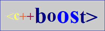
I like the concept but not the logo... here is a take on the same concept without the explicit rocket image and an emphasis on the Open Source part of <c++ boOSt> See, you can just type the logo too :-) matt. happy user of <c++ boOSt>
On Tue, 23 Nov 2004 10:32:56 +1100, Matt Hurd <matt.hurd@gmail.com> wrote:
IOn Mon, 22 Nov 2004 17:53:03 -0500, Jonathan Brandmeyer
<jbrandmeyer@earthlink.net> wrote:
On Mon, 2004-11-22 at 16:06 -0600, Rene Rivera wrote:
True, but it will likely be easier to decide on the substance of the logo without the text. No distractions that way. Not that one should forget totally about the text. But it's much easier to think about what can represent Boost, without the word Boost in it.
So far I see three different concepts for logo:
1) The "<>" brackets.
2) The "++" operator.
3) The rocket.
Perhaps discussing what the logo substance is before getting to deep into the design is best?
I like the concept but not the logo... here is a take on the same concept without the explicit rocket image and an emphasis on the Open Source part of <c++ boOSt>
See, you can just type the logo too :-)
matt. happy user of <c++ boOSt>
Please no. Yuck. -- Caleb Epstein caleb dot epstein at gmail dot com
Jonathan Brandmeyer <jbrandmeyer@earthlink.net> writes:
On Mon, 2004-11-22 at 16:06 -0600, Rene Rivera wrote:
True, but it will likely be easier to decide on the substance of the logo without the text. No distractions that way. Not that one should forget totally about the text. But it's much easier to think about what can represent Boost, without the word Boost in it.
So far I see three different concepts for logo:
1) The "<>" brackets.
2) The "++" operator.
3) The rocket.
Perhaps discussing what the logo substance is before getting to deep into the design is best?
I rather like the idea of using a rocket, because it symbolizes the use of Boost to launch C++ library proposals into the standard.
I like all those connotations. For what it's worth, we considered a rocket for Boost Consulting's logo but dropped it because of possible aerospace connotations.
What about some variation of this for it? The rocket is intended to look a bit like the space shuttle's SRB's.
Oof. Looks like an ICBM to me. Definitely not the message I want to send. And any rocket should be going up ;-) -- Dave Abrahams Boost Consulting http://www.boost-consulting.com

Rene Rivera wrote:
So far I see three different concepts for logo:
1) The "<>" brackets.
2) The "++" operator.
3) The rocket.
Perhaps discussing what the logo substance is before getting to deep into the design is best?
Are there other concepts that would work?
How about something reminiscent of the old logo: a jaggy graph pointing upwards. << BTW, I agree, kill the c++ >> -- Joel de Guzman http://www.boost-consulting.com http://spirit.sf.net

On Monday, November 22, 2004, at 04:44 PM, David Abrahams wrote:
"Peter Dimov" <pdimov@mmltd.net> writes:
David Abrahams wrote:
Rene Rivera <grafik.list@redshift-software.com> writes:
I think that's what both Joaquin and I are saying. Boost by itself, I think, is recognizable all by itself. Many people already know what it is, well at least many in the developer community. I don't think we need the C++ to be explicitly there. And trying to put it there causes all kinds of problems because one ends up doing other things to make it fit in, re: the "/".
I kind of agree. Iconography.
Hmm.
I think it's worth pursuing the idea of
boost/
where the slash is actually a rocket ascending. I tried to convey that with an earlier attempt but it probably didn't communicate.
I'm not a logo expert by any stretch of the imagination... but it seems to me that if you have a rocket, you don't need the text "boost". The rocket is the logo. It needs to have some unique visual features that establish its identity as the "boost/C++" rocket, of course.
Interesting. But every logo I've seen includes the name of the entity it stands for somehow. Even if the rocket isn't part of some "Boost" text, you need to choose a font for "Boost" and decide how it sits next to or below the rocket.
Or _on_ it. Anternately the '++' / 'C++' could be on the rocket.

-----Original Message----- From: boost-bounces@lists.boost.org [mailto:boost-bounces@lists.boost.org] On Behalf Of David Abrahams Sent: Monday, November 22, 2004 2:45 PM To: boost@lists.boost.org Subject: [boost] Re: Logo... and page design.
"Peter Dimov" <pdimov@mmltd.net> writes:
David Abrahams wrote:
Rene Rivera <grafik.list@redshift-software.com> writes:
I think that's what both Joaquin and I are saying. Boost by itself, I think, is recognizable all by itself. Many people already know what it is, well at least many in the developer community. I don't think we need the C++ to be explicitly there. And trying to put it there causes all kinds of problems because one ends up doing other things to make it fit in, re: the "/".
I kind of agree. Iconography.
Hmm.
I think it's worth pursuing the idea of
boost/
where the slash is actually a rocket ascending. I tried to convey that with an earlier attempt but it probably didn't communicate.
I'm not a logo expert by any stretch of the imagination... but it seems to me that if you have a rocket, you don't need the text "boost". The rocket is the logo. It needs to have some unique visual features that establish its identity as the "boost/C++" rocket, of course.
Interesting. But every logo I've seen includes the name of the entity it stands for somehow. Even if the rocket isn't part of some "Boost" text, you need to choose a font for "Boost" and decide how it sits next to or below the rocket.
Well, what about the Nike "swoosh?" But just so I don't come off as a useless kibitzer, I've attached an attempt. Probably too busy with the effects (just wanted it to look reasonably good for a quick knock-out), but the basic idea could easily be reduced to something very simple. And if someone's already submitted something like this, I apologize; I'm on a dead run right now, and don't have time to read the whole thread or look at more than a few of the submitted logos. I worked from two basics: an abstraction of the meaning of "boost," which I implied with the up-arrow shape, shadow-duped to imply comic-book-style upward motion; and the doubled plus-signs, which seem to me to convey both "boost" and a connection with C++, while not requiring any reading, per se (I'll argue that to a C++ coder, the increment operator is pretty well iconic already, probably so in some sense even to a non-coder). I would agree with the comments (don't know who made them originally) in favor of simplicity, but would remind everyone of the obvious Einstein quote. Incidentally, if you really want a good idea of what logos are out there, just go to any major library that has the current trademark database in its government documents section (at least, this is true in the US) and start looking up companies to see what they trademarked. Incidentally, the IBM trademark is a really interesting one in terms of exactly what it covers (and what they've sued over in the past), especially since it's exactly the opposite kind of trademark, and probably the one Dave first thought of when he made the remark concerning logos always having the product or company name included; the IBM logo *is* the company name (with some interesting flourishes--see the actual phrasing of the trademark application <g>). Reid

Peter Dimov wrote:
I'm not a logo expert by any stretch of the imagination... but it seems to me that if you have a rocket, you don't need the text "boost". The rocket is the logo. It needs to have some unique visual features that establish its identity as the "boost/C++" rocket, of course.
I know even less than Peter, but that sounds good to me. I hope someone can give this a shot.
participants (16)
-
 Bronek Kozicki
 -
 Caleb Epstein
 -
 Carlo Wood
 -
 David Abrahams
 -
 David B. Held
 -
 Deane Yang
 -
 Jeff Garland
 -
 Joel
Joel -
 Jonathan Brandmeyer
 -
 Mark Blewett
 -
 Matt Hurd
 -
 Michael Walter
 -
 Peter Dimov
 -
 Reid Sweatman
 -
 Rene Rivera
 -
 Rich Johnson