Front page, one last time.

Boosters, OK, I haven't heard anything in the way of further comment on the new front page design. I've put in a version of the current logo while we work that out. And done some minor cleanup of the css and xhtml: http://redshift-software.com/~grafik/boost/index.htm Boost C++ Libraries If there aren't any serious objections, I'll go ahead and commit this to CVS. -- -- Grafik - Don't Assume Anything -- Redshift Software, Inc. - http://redshift-software.com -- rrivera/acm.org - grafik/redshift-software.com - 102708583/icq

Rene Rivera wrote:
Boosters,
OK, I haven't heard anything in the way of further comment on the new front page design. I've put in a version of the current logo while we work that out. And done some minor cleanup of the css and xhtml:
http://redshift-software.com/~grafik/boost/index.htm Boost C++ Libraries
If there aren't any serious objections, I'll go ahead and commit this to CVS.
<cough> Sorry! All of the monospace text is unreadably small in a default (I think) IE6 configuration. At least it is in mine. It comes out as something lik 6 or 7 point courier. -- Dave Abrahams Boost Consulting http://www.boost-consulting.com

I have to agree, same experience with my IE6. Even if I increase the text size from Medium(default) to Larger, the monospace fonts are much smaller than the other ones. Robert Ramey
All of the monospace text is unreadably small in a default (I think) IE6 configuration. At least it is in mine. It comes out as something lik 6 or 7 point courier.

At 04:47 PM 12/12/2004, Robert Ramey wrote:
I have to agree, same experience with my IE6. Even if I increase the text size from Medium(default) to Larger, the monospace fonts are much smaller than the other ones.
Robert Ramey
All of the monospace text is unreadably small in a default (I think) IE6 configuration. At least it is in mine. It comes out as something lik 6 or 7 point courier.
Same here on a notebook LCD screen. But Firefox doesn't have the monospace font problem. --Beman
Beman Dawes wrote:
At 04:47 PM 12/12/2004, Robert Ramey wrote:
I have to agree, same experience with my IE6. Even if I increase the text size from Medium(default) to Larger, the monospace fonts are much smaller than the other ones.
Robert Ramey
All of the monospace text is unreadably small in a default (I think) IE6 configuration. At least it is in mine. It comes out as something lik 6 or 7 point courier.
Same here on a notebook LCD screen. But Firefox doesn't have the monospace font problem.
Fixed. And made sure the size is consistent across browsers. Jeff Garland wrote:
I did some testing -- mostly good results.
Platform/Browser Linux/Epiphany -- fine (minor chopping of logo on left side) Linux/Firefox -- fine (minor chopping of logo on left side) Linux/Galeon -- fine (minor chopping of logo on left side)
Can't do much about that even if we had a vector version :-( One possibility is to let it bleed into the rest of the text. Not a good choice IMO.
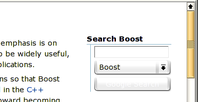
Linux/Konqueror -- Search did not render Google logo, instead a button with 'Google Search' (doesn't quite look right).
Not all browsers support enough of CSS to change the button image, but they should fall back to showing the button label. How does it not look right? Is it too small? (I just changed it so for a possible fix in this case) Is the text messed up somehow? Also, no
rollover display on left side menu. This is
Konqueror
3.2.0
Again, not all browsers are smart enough :-( For example IE doesn't display the rollover frame highlight on the menu either.
Win98/IE 6 -- fine Win98/Firefox -- fine Win98/Netscape 7 -- fine
WinXPSP2/IE 6 -- fine WinXPSP2/Firefox -- fine
Thanks :-)
Couple minor thoughts:
1) I noticed slow loading of the W3C graphics. I think in the final version we should make these local to the boost site (or ditch them).
Changed now, it might still be slow as my upload bandwidth is only a T1.
2) Can we expand the search box a bit? I think it would make it more obvious and since your design nicely flows the text adding a bit more room wouldn't really change the page much.
Yes, done.
Anyway, excellent work!
Thank you! Daniel Frey wrote:
Two things I noticed, using Firefox:
Moving the mouse over the navigation bar leads to the items to flicker on mouse-over/mouse-away. Maybe just a Firefox-issue? But then. "normal" links don't show that problem...
It's a Firefox only problem AFAIK. Minor problem though ;-)
The second point is, that the headline for 1.31.0 is now left of Aleksey Gurtovoy's picture. Maybe that's due to my screensize (1600x1200), which allows a lot of text in a single line, so there are not enough lines in the paragraph that contains the image.
Nice catch! Fixed now. -- -- Grafik - Don't Assume Anything -- Redshift Software, Inc. - http://redshift-software.com -- rrivera/acm.org - grafik/redshift-software.com - 102708583/icq

For a library all about portability, the webpage having so much quirks depending on what browser you use doesn't seem to fit - I hope you can get them all fixed. I do like the clean design though. Good job. On Mon, 13 Dec 2004 20:28:16 -0600, Rene Rivera <grafik.list@redshift-software.com> wrote:
Beman Dawes wrote:
At 04:47 PM 12/12/2004, Robert Ramey wrote:
I have to agree, same experience with my IE6. Even if I increase the text size from Medium(default) to Larger, the monospace fonts are much smaller than the other ones.
Robert Ramey
All of the monospace text is unreadably small in a default (I think) IE6 configuration. At least it is in mine. It comes out as something lik 6 or 7 point courier.
Same here on a notebook LCD screen. But Firefox doesn't have the monospace font problem.
Fixed. And made sure the size is consistent across browsers.
Jeff Garland wrote:
I did some testing -- mostly good results.
Platform/Browser Linux/Epiphany -- fine (minor chopping of logo on left side) Linux/Firefox -- fine (minor chopping of logo on left side) Linux/Galeon -- fine (minor chopping of logo on left side)
Can't do much about that even if we had a vector version :-( One possibility is to let it bleed into the rest of the text. Not a good choice IMO.
Linux/Konqueror -- Search did not render Google logo, instead a button with 'Google Search' (doesn't quite look right).
Not all browsers support enough of CSS to change the button image, but they should fall back to showing the button label. How does it not look right? Is it too small? (I just changed it so for a possible fix in this case) Is the text messed up somehow?
Also, no
rollover display on left side menu. This is
Konqueror
3.2.0
Again, not all browsers are smart enough :-( For example IE doesn't display the rollover frame highlight on the menu either.
Win98/IE 6 -- fine Win98/Firefox -- fine Win98/Netscape 7 -- fine
WinXPSP2/IE 6 -- fine WinXPSP2/Firefox -- fine
Thanks :-)
Couple minor thoughts:
1) I noticed slow loading of the W3C graphics. I think in the final version we should make these local to the boost site (or ditch them).
Changed now, it might still be slow as my upload bandwidth is only a T1.
2) Can we expand the search box a bit? I think it would make it more obvious and since your design nicely flows the text adding a bit more room wouldn't really change the page much.
Yes, done.
Anyway, excellent work!
Thank you!
Daniel Frey wrote:
Two things I noticed, using Firefox:
Moving the mouse over the navigation bar leads to the items to flicker on mouse-over/mouse-away. Maybe just a Firefox-issue? But then. "normal" links don't show that problem...
It's a Firefox only problem AFAIK. Minor problem though ;-)
The second point is, that the headline for 1.31.0 is now left of Aleksey Gurtovoy's picture. Maybe that's due to my screensize (1600x1200), which allows a lot of text in a single line, so there are not enough lines in the paragraph that contains the image.
Nice catch! Fixed now.
-- -- Grafik - Don't Assume Anything -- Redshift Software, Inc. - http://redshift-software.com -- rrivera/acm.org - grafik/redshift-software.com - 102708583/icq _______________________________________________ Unsubscribe & other changes: http://lists.boost.org/mailman/listinfo.cgi/boost
-- Cory Nelson http://www.int64.org
Cory Nelson wrote:
For a library all about portability, the webpage having so much quirks depending on what browser you use doesn't seem to fit - I hope you can get them all fixed.
As we all know, standard compliance means different things to different standards implementors. And as we know from the "portable" Boost libraries, it's only as portable as testing has shown it to be ;-)
I do like the clean design though. Good job.
Thank you :-) -- -- Grafik - Don't Assume Anything -- Redshift Software, Inc. - http://redshift-software.com -- rrivera/acm.org - grafik/redshift-software.com - 102708583/icq

Rene Rivera <grafik.list@redshift-software.com> writes:
Beman Dawes wrote:
Linux/Konqueror -- Search did not render Google logo, instead a button with 'Google Search' (doesn't quite look right).
Not all browsers support enough of CSS to change the button image, but they should fall back to showing the button label. How does it not look right? Is it too small? (I just changed it so for a possible fix in this case) Is the text messed up somehow?
Having images on web-site buttons is awkward; you need to provide alternate text for those people who don't have browsers capable of rendering the image, but this needs to be hidden if the browser is showing the image. Setting the indent to -9000px (as you have) works, *except* if you have a browser *capable* of showing the image (e.g. Firefox/Win2k), but with image viewing disabled --- in which case you don't get anything displayed at all. In the past I have given up trying, and just had a text button. I thought about maybe having a block with a background image directly on top of a text button. That way, if the image isn't visible (for *any* reason), then the text shows through. I don't know how easy that is to arrange, though; I didn't get as far as trying it. In any case, the Google button does nothing to indicate that it is a button (unless you click on it): it has no border, it doesn't highlight when the mouse goes over it, and the cursor doesn't change either. (Tested in firefox/win2k) Anthony -- Anthony Williams Software Developer
Anthony Williams wrote:
Having images on web-site buttons is awkward; you need to provide alternate text for those people who don't have browsers capable of rendering the image, but this needs to be hidden if the browser is showing the image. Setting the indent to -9000px (as you have) works, *except* if you have a browser *capable* of showing the image (e.g. Firefox/Win2k), but with image viewing disabled --- in which case you don't get anything displayed at all.
Hm, interesting problem, not sure how often it comes up. And that button does have an alt which it should have displayed, without shifting the text away :-( I'll see what I can do to make the text show up in this circumstance.
In the past I have given up trying, and just had a text button. I thought about maybe having a block with a background image directly on top of a text button. That way, if the image isn't visible (for *any* reason), then the text shows through. I don't know how easy that is to arrange, though; I didn't get as far as trying it.
The usual text buttons are just offensive to the style of web pages. They're even offensive in the regular GUI, which is why you see many applications use image buttons instead.
In any case, the Google button does nothing to indicate that it is a button (unless you click on it): it has no border, it doesn't highlight when the mouse goes over it, and the cursor doesn't change either. (Tested in firefox/win2k)
It's not meant to indicate it's a button. It's meant to look like a logo label. The button functionality is actually superfluous as you can just press return to do the search. But submit input item is required fr the form, and text browsers, and 508 accessibility. So I don't think it's important or desirable having it announce itself as a button. -- -- Grafik - Don't Assume Anything -- Redshift Software, Inc. - http://redshift-software.com -- rrivera/acm.org - grafik/redshift-software.com - 102708583/icq

On Tue, Dec 14, 2004 at 09:10:23AM -0600, Rene Rivera wrote: [...]
It's not meant to indicate it's a button. It's meant to look like a logo label. The button functionality is actually superfluous as you can just press return to do the search. But submit input item is required fr the form, and text browsers, and 508 accessibility. So I don't think it's important or desirable having it announce itself as a button.
But it shouldn't give the impression of an "empty" button either... I am not sure whether it is due to some recent changes or whether I simply missed it before, but on Konqueror 3.3.2 the button appears with a white font on a light grey background. It's very hard to decipher unless you know what is supposed to be written there. I am going to attach a screenshot that shows the problem. Regards Christoph -- http://www.informatik.tu-darmstadt.de/TI/Mitarbeiter/cludwig.html LiDIA: http://www.informatik.tu-darmstadt.de/TI/LiDIA/Welcome.html
Rene Rivera <grafik.list@redshift-software.com> writes:
Anthony Williams wrote:
Having images on web-site buttons is awkward; you need to provide alternate text for those people who don't have browsers capable of rendering the image, but this needs to be hidden if the browser is showing the image. Setting the indent to -9000px (as you have) works, *except* if you have a browser *capable* of showing the image (e.g. Firefox/Win2k), but with image viewing disabled --- in which case you don't get anything displayed at all.
Hm, interesting problem, not sure how often it comes up. And that button does have an alt which it should have displayed, without shifting the text away :-( I'll see what I can do to make the text show up in this circumstance.
Just for reference, the same problem occurs with IE6 if "Show Pictures" is turned off. It seems that modern browsers aren't very keen to show the alt text (though they do tend to show it if the image can't be found, or hasn't loaded yet)
In the past I have given up trying, and just had a text button. I thought about maybe having a block with a background image directly on top of a text button. That way, if the image isn't visible (for *any* reason), then the text shows through. I don't know how easy that is to arrange, though; I didn't get as far as trying it.
The usual text buttons are just offensive to the style of web pages. They're even offensive in the regular GUI, which is why you see many applications use image buttons instead.
When I say "text button", I didn't mean <input type="button">, rather I meant an <a> tag with a text label, and fancy styling. E.g. Make it a block element, use border styles to give it a 3d look, and A:hover to highlight it when the mouse moves over it. Of course, you can make it nicer than a simple "3d button" if you've got the time, patience and flair :-) Anthony -- Anthony Williams Software Developer

On Tue, 14 Dec 2004 10:33:04 +0000, Anthony Williams <anthony_w.geo@yahoo.com> wrote:
Having images on web-site buttons is awkward; you need to provide alternate text for those people who don't have browsers capable of rendering the image, but this needs to be hidden if the browser is showing the image.
I'd also like to add my two cents and say that the "Google" logo button looks nice, but is not intiutive from a UI perspective. Because of the lack of edges and other canonical button-like decoration, it is not immediately obivious that it IS a button. It could just be a logo (e.g. "Search Powered by Google"). I'd suggest either modifying the image to contain some additional button "look and feel" or just keeping with a plain old, less sexy text button. -- Caleb Epstein caleb dot epstein at gmail dot com
Rene Rivera wrote:
Beman Dawes wrote:
At 04:47 PM 12/12/2004, Robert Ramey wrote:
I have to agree, same experience with my IE6. Even if I increase the text size from Medium(default) to Larger, the monospace fonts are much smaller than the other ones.
Robert Ramey
All of the monospace text is unreadably small in a default (I think) IE6 configuration. At least it is in mine. It comes out as something lik 6 or 7 point courier.
Same here on a notebook LCD screen. But Firefox doesn't have the monospace font problem.
Fixed. And made sure the size is consistent across browsers.
http://redshift-software.com/~grafik/boost/index.htm (for reference). This is fantastic. All in all a vast improvement, and the web typography problem is solved! And now, being -- as my wife likes to say -- a fussy virgo, I have a little more input. When you back up and look at the overall balance of the page layout, it doesn't quite seem to work yet. For one thing, we have the Google search box floating all by itself over on the right, and directly across from it on the left there is a blank space where the search box could nearly fit. Why not just put it there? Also, I'm not positive about this, but I think it *might* work better if the index column on the left were lightly shaded, or a thin line was used to divide it from the text to the right. This might prove to be no improvement at all once the search box is moved, I don't know. Finally, the page seems to demand some sort of more prominent title at the beginning of the text. It's just a feeling I have, but think of how any of the major newspapers are titled: T H E C H I C A G O T R I B U N E ------------------------------------- left column middle column middle left column column middle column left column middle column middle left column column middle column ... Maybe something similar would work for us. Another issue I have with many web pages is that when browser windows are maximized, the lines of text are simply too long to read. I lose track of what line I was on when scanning back at the end of each one. The only way to handle this properly would be to have a right margin whose position is proportional to the font size used for display; I don't think there's a way to do that with HTML, but then again I don't know much. Last of all, the "revised date" and copyright don't seem to add anything but distraction when placed on the left. I think they belong at the bottom along with the other things most people don't care about ;-) -- Dave Abrahams Boost Consulting http://www.boost-consulting.com

David Abrahams writes:
http://redshift-software.com/~grafik/boost/index.htm
(for reference).
This is fantastic. All in all a vast improvement, and the web typography problem is solved! And now, being -- as my wife likes to say -- a fussy virgo, I have a little more input.
When you back up and look at the overall balance of the page layout, it doesn't quite seem to work yet.
Same sentiments here. Also, one other thing that doesn't look like an improvement to me at all is the new layout/appearance of unordered lists. For instance, on the proposed page the "New Libraries" subsection for 1.32.0 release is close to being unreadable; the layout of text is so confusing that it's almost impossible to grasp the names of the new libraries at once without making a special effort (you can compare it with the current main page to see what I'm talking about). I guess the links color contributes to the effect. I'd like to see this fixed. What's wrong with the conventional layout, anyway? -- Aleksey Gurtovoy MetaCommunications Engineering
Aleksey Gurtovoy writes:
David Abrahams writes:
http://redshift-software.com/~grafik/boost/index.htm
(for reference).
This is fantastic. All in all a vast improvement, and the web typography problem is solved! And now, being -- as my wife likes to say -- a fussy virgo, I have a little more input.
When you back up and look at the overall balance of the page layout, it doesn't quite seem to work yet.
Same sentiments here.
Also, one other thing that doesn't look like an improvement to me at all is the new layout/appearance of unordered lists. For instance, on the proposed page the "New Libraries" subsection for 1.32.0 release is close to being
unreadable; the layout of text is so confusing that it's almost impossible to grasp the names of the new libraries at once without making a special
effort
Almost like it is with the above paragraph ;). Sorry for the messed up formatting. -- Aleksey Gurtovoy MetaCommunications Engineering
David Abrahams wrote:
http://redshift-software.com/~grafik/boost/index.htm
(for reference).
This is fantastic. All in all a vast improvement, and the web typography problem is solved! And now, being -- as my wife likes to say -- a fussy virgo, I have a little more input.
When you back up and look at the overall balance of the page layout, it doesn't quite seem to work yet. For one thing, we have the Google search box floating all by itself over on the right,
Which wasn't a problem on the original because the search was in the content flow.
and directly across from it on the left there is a blank space where the search box could nearly fit. Why not just put it there? Also, I'm not positive about this, but I think it *might* work better if the index column on the left were lightly shaded, or a thin line was used to divide it from the text to the right. This might prove to be no improvement at all once the search box is moved, I don't know. Finally, the page seems to demand some sort of more prominent title at the beginning of the text. It's just a feeling I have, but think of how any of the major newspapers are titled:
T H E C H I C A G O T R I B U N E ------------------------------------- left column middle column middle left column column middle column left column middle column middle left column column middle column
...
Maybe something similar would work for us.
Yes, I'll answer all that with.. My preferred layout when I do web pages is this (using your example): T H E C H I C A G O T R I B U N E ------------------------------------- content content content right column content content content right column content content content right column content content content right column It has a variety of advantages.. * It puts the content vs. navigation in the natural, for most people, left-to-right reading order. * It allows the use of any left side marks on the right column to act as an additional separator instead of adding artificial ones as you suggest. * It allows more flexibility with the heading without breaking the overall structure. Note, I did not originally go this way because I know how much of "traditional" group Boost is ;-) So I tried not to stray too far from the current layout.
Another issue I have with many web pages is that when browser windows are maximized, the lines of text are simply too long to read. I lose track of what line I was on when scanning back at the end of each one. The only way to handle this properly would be to have a right margin whose position is proportional to the font size used for display; I don't think there's a way to do that with HTML, but then again I don't know much.
The margins are already font proportional. I think you meant inversely proportional? Which is not possible.
Last of all, the "revised date" and copyright don't seem to add anything but distraction when placed on the left. I think they belong at the bottom along with the other things most people don't care about ;-)
I'll push it to the bottom. -- -- Grafik - Don't Assume Anything -- Redshift Software, Inc. - http://redshift-software.com -- rrivera/acm.org - grafik/redshift-software.com - 102708583/icq
Rene Rivera wrote:
David Abrahams wrote:
http://redshift-software.com/~grafik/boost/index.htm
(for reference).
This is fantastic. All in all a vast improvement, and the web typography problem is solved!
Oh darn. I went through this whole process with Bill Venners of Artima and failed to mention it earlier. See my "web typography" post from 5 minutes ago.
And now, being -- as my wife likes to say -- a fussy virgo, I have a little more input.
When you back up and look at the overall balance of the page layout, it doesn't quite seem to work yet. For one thing, we have the Google search box floating all by itself over on the right,
Which wasn't a problem on the original because the search was in the content flow.
Right.
Yes, I'll answer all that with.. My preferred layout when I do web pages is this (using your example):
T H E C H I C A G O T R I B U N E ------------------------------------- content content content right column content content content right column content content content right column content content content right column
It has a variety of advantages.. * It puts the content vs. navigation in the natural, for most people, left-to-right reading order. * It allows the use of any left side marks on the right column to act as an additional separator instead of adding artificial ones as you suggest. * It allows more flexibility with the heading without breaking the overall structure.
Note, I did not originally go this way because I know how much of "traditional" group Boost is ;-) So I tried not to stray too far from the current layout.
I think you should try it. As you might guess from http://www.boost-consulting.com I am not averse to it.
Another issue I have with many web pages is that when browser windows are maximized, the lines of text are simply too long to read. I lose track of what line I was on when scanning back at the end of each one. The only way to handle this properly would be to have a right margin whose position is proportional to the font size used for display; I don't think there's a way to do that with HTML, but then again I don't know much.
The margins are already font proportional. I think you meant inversely proportional? Which is not possible.
No, I mean proportional. That is, I would like to have a maximum width into which all of the page text will flow. I'd like that width to normally be considerably less than that of my screen, and I'd like it to change proportionally to the font size. If that's what you've got, it's not showing up on IE6 or Firefox.
Last of all, the "revised date" and copyright don't seem to add anything but distraction when placed on the left. I think they belong at the bottom along with the other things most people don't care about ;-)
I'll push it to the bottom.
Thangu. -- Dave Abrahams Boost Consulting http://www.boost-consulting.com
David Abrahams wrote:
Rene Rivera wrote:
Note, I did not originally go this way because I know how much of "traditional" group Boost is ;-) So I tried not to stray too far from the current layout.
I think you should try it. As you might guess from http://www.boost-consulting.com I am not averse to it.
I will... I just have to grapple with my own fears of copying myself as it will look like the design I'm doing for Spirit :-\
The margins are already font proportional. I think you meant inversely proportional? Which is not possible.
No, I mean proportional.
OK..
That is, I would like to have a maximum width into which all of the page text will flow.
Possible, but has its own set of problems..
I'd like that width to normally be considerably less than that of my screen,
Not possible.. The problem is defining "my screen". Since that changes for everyone one can never have a measure that includes everyone. Of course it is theoretically possible to dynamically find that size using Javascript, but then we know how much luck we've had with Javascript.
and I'd like it to change proportionally to the font size. If that's what you've got, it's not showing up on IE6 or Firefox.
What I currently have is that all measurements are specified in em's (the width of 'M' for the untrained), unless it's something that is specifying the size of a bitmap image. This means that the margins will be larger when you make the font larger, and inversely smaller font, smaller margins. I alluded to problems.. One is that the 'max-width' CSS property, which is what you are wanting, is only available in CSS2. So browsers like IE don't support it. -- -- Grafik - Don't Assume Anything -- Redshift Software, Inc. - http://redshift-software.com -- rrivera/acm.org - grafik/redshift-software.com - 102708583/icq
Rene Rivera wrote:
David Abrahams wrote:
Rene Rivera wrote:
Note, I did not originally go this way because I know how much of "traditional" group Boost is ;-) So I tried not to stray too far from the current layout.
I think you should try it. As you might guess from http://www.boost-consulting.com I am not averse to it.
I will... I just have to grapple with my own fears of copying myself as it will look like the design I'm doing for Spirit :-\
I don't think there's anything wrong with the main Boost site and Spirit's site being similar.
That is, I would like to have a maximum width into which all of the page text will flow.
Possible, but has its own set of problems..
I'd like that width to normally be considerably less than that of my screen,
Not possible.. The problem is defining "my screen". Since that changes for everyone one can never have a measure that includes everyone.
I didn't mean to establish a technical criterion there or say that it should work for everyone. I just wanted to say that the text shouldn't stretch all the way across an average computer screen when the window is maximized.
Of course it is theoretically possible to dynamically find that size using Javascript, but then we know how much luck we've had with Javascript.
Heh.
and I'd like it to change proportionally to the font size. If that's what you've got, it's not showing up on IE6 or Firefox.
What I currently have is that all measurements are specified in em's (the width of 'M' for the untrained), unless it's something that is specifying the size of a bitmap image. This means that the margins will be larger when you make the font larger, and inversely smaller font, smaller margins.
Right. But the right margin is always measured relative to the right edge of the screen. I want a maximum and minimum distance that it can deviate from the left edge. Am I the only person who thinks this is important? Does everybody out there print their text documents in landscape orientation with a small font? Why hasn't the W3C made it possible to express this?
I alluded to problems.. One is that the 'max-width' CSS property, which is what you are wanting, is only available in CSS2. So browsers like IE don't support it.
Oh, so they have. But MS is behind the curve. Nice. -- Dave Abrahams Boost Consulting http://www.boost-consulting.com

David B. Held wrote:
David Abrahams wrote:
Oh, so they have. But MS is behind the curve. Nice.
Don't you think it's time to try FireFox? ;>
I have it; I'm running it now. Last time I tried it there were just enough annoyances that I stopped using it. No google bar, for one ;-) I forgot what else. -- Dave Abrahams Boost Consulting http://www.boost-consulting.com
On Tue, 14 Dec 2004 23:58:34 -0500, David Abrahams <dave@boost-consulting.com> wrote:
I have it; I'm running it now. Last time I tried it there were just enough annoyances that I stopped using it. No google bar, for one ;-) I forgot what else.
Its far better since 0.7 or so. I can't live w/o tabbed browsing now. I first got used to it in Opera, which was my #1 browser for a long time, but it started to get unstable. Firefox plus a few extra extensions is probably the best game in town these days. -- Caleb Epstein caleb dot epstein at gmail dot com
Caleb Epstein <caleb.epstein@gmail.com> writes:
On Tue, 14 Dec 2004 23:58:34 -0500, David Abrahams <dave@boost-consulting.com> wrote:
I have it; I'm running it now. Last time I tried it there were just enough annoyances that I stopped using it. No google bar, for one ;-) I forgot what else.
Firefox plus a few extra extensions is probably the best game in town these days.
I agree. *And* there is a googlebar extension for Firefox. Anthony -- Anthony Williams Software Developer
On Wed, 15 Dec 2004 12:25:17 +0000, Anthony Williams <anthony_w.geo@yahoo.com> wrote:
*And* there is a googlebar extension for Firefox.
What does this give you that the built in Search widget and the other Firefox features don't already (e.g. auto-fill, popup blocking, etc)? http://googlebar.mozdev.org/ -- Caleb Epstein caleb dot epstein at gmail dot com

Sorry, I didn't see obvious improvement to the current front page. "Rene Rivera" <grafik.list@redshift-software.com>
Boosters,
OK, I haven't heard anything in the way of further comment on the new front page design. I've put in a version of the current logo while we work that out. And done some minor cleanup of the css and xhtml:
http://redshift-software.com/~grafik/boost/index.htm Boost C++ Libraries
If there aren't any serious objections, I'll go ahead and commit this to CVS.

On Mon, 13 Dec 2004 03:41:34 +0800, Allen Yao wrote
Sorry, I didn't see obvious improvement to the current front page.
It has a more modern look and feel -- search is moved out of the main text flow. I think it's a big improvement personally. I did some testing -- mostly good results. Platform/Browser Linux/Epiphany -- fine (minor chopping of logo on left side) Linux/Firefox -- fine (minor chopping of logo on left side) Linux/Galeon -- fine (minor chopping of logo on left side) Linux/Konqueror -- Search did not render Google logo, instead a button with 'Google Search' (doesn't quite look right). Also, no rollover display on left side menu. This is Konqueror 3.2.0 Win98/IE 6 -- fine Win98/Firefox -- fine Win98/Netscape 7 -- fine WinXPSP2/IE 6 -- fine WinXPSP2/Firefox -- fine Couple minor thoughts: 1) I noticed slow loading of the W3C graphics. I think in the final version we should make these local to the boost site (or ditch them). 2) Can we expand the search box a bit? I think it would make it more obvious and since your design nicely flows the text adding a bit more room wouldn't really change the page much. Anyway, excellent work! Jeff

Rene Rivera wrote:
OK, I haven't heard anything in the way of further comment on the new front page design. I've put in a version of the current logo while we work that out. And done some minor cleanup of the css and xhtml:
http://redshift-software.com/~grafik/boost/index.htm Boost C++ Libraries
If there aren't any serious objections, I'll go ahead and commit this to CVS.
Two things I noticed, using Firefox: Moving the mouse over the navigation bar leads to the items to flicker on mouse-over/mouse-away. Maybe just a Firefox-issue? But then. "normal" links don't show that problem... The second point is, that the headline for 1.31.0 is now left of Aleksey Gurtovoy's picture. Maybe that's due to my screensize (1600x1200), which allows a lot of text in a single line, so there are not enough lines in the paragraph that contains the image. Regards, Daniel

On 12/12/04 8:54 AM, "Rene Rivera" <grafik.list@redshift-software.com> wrote:
Boosters,
OK, I haven't heard anything in the way of further comment on the new front page design. I've put in a version of the current logo while we work that out. And done some minor cleanup of the css and xhtml:
http://redshift-software.com/~grafik/boost/index.htm Boost C++ Libraries
If there aren't any serious objections, I'll go ahead and commit this to CVS.
Safari displays a blank page. All white space. On Mac IE... I don't know how to describe it, but it doesn't look like the Win IE version. It appears to be missing some structure. There is no left column and the ">>" icons do not appear. -- Jon
On Sun, Dec 12, 2004 at 12:10:57PM -0800, Jon Kalb wrote:
On 12/12/04 8:54 AM, "Rene Rivera" <grafik.list@redshift-software.com> wrote:
Boosters,
OK, I haven't heard anything in the way of further comment on the new front page design. I've put in a version of the current logo while we work that out. And done some minor cleanup of the css and xhtml:
http://redshift-software.com/~grafik/boost/index.htm Boost C++ Libraries
If there aren't any serious objections, I'll go ahead and commit this to CVS.
Safari displays a blank page. All white space.
The same here with Konqueror 3.3.2 on a Linux box. However, if I go from the Boost page somewhere else and then press the back button, the Boost page is displayed. (In fact, I submitted the page to the W3C validator that didn't find any flaws. When I then pressed "back" the Boost page appeared.) If I then press "reload", then I have a blank page again. When I switch of JavaScript then the browser displays the page at once, But without JavaScript the menu bar is not displayed to the left but below the main page... :-( I don't know JavaScript so I cannot assess whether there is a problem with your JavaScript code. But even if it is a browser bug, a potential user might be annoyed and turn away if all the browser presents at www.boost.org is a white page. Regards Christoph -- http://www.informatik.tu-darmstadt.de/TI/Mitarbeiter/cludwig.html LiDIA: http://www.informatik.tu-darmstadt.de/TI/LiDIA/Welcome.html
Christoph Ludwig wrote:
On Sun, Dec 12, 2004 at 12:10:57PM -0800, Jon Kalb wrote:
Safari displays a blank page. All white space.
The same here with Konqueror 3.3.2 on a Linux box.
Thanks for the extra testing :-) Now that iCapture is back up I can do the Safari testing and fixed the immediate problem.
I don't know JavaScript so I cannot assess whether there is a problem with your JavaScript code. But even if it is a browser bug, a potential user might be annoyed and turn away if all the browser presents at www.boost.org is a white page.
Yes.. No amount of Javascript is worth it in this case if it breaks on some browsers. Which was the problem.. When I removed the JS, which was entirely optional, it works in Safari. -- -- Grafik - Don't Assume Anything -- Redshift Software, Inc. - http://redshift-software.com -- rrivera/acm.org - grafik/redshift-software.com - 102708583/icq
On Mon, Dec 13, 2004 at 06:32:24PM -0600, Rene Rivera wrote:
Christoph Ludwig wrote:
On Sun, Dec 12, 2004 at 12:10:57PM -0800, Jon Kalb wrote:
Safari displays a blank page. All white space.
The same here with Konqueror 3.3.2 on a Linux box.
Thanks for the extra testing :-) Now that iCapture is back up I can do the Safari testing and fixed the immediate problem.
I don't know JavaScript so I cannot assess whether there is a problem with your JavaScript code. But even if it is a browser bug, a potential user might be annoyed and turn away if all the browser presents at www.boost.org is a white page.
Yes.. No amount of Javascript is worth it in this case if it breaks on some browsers. Which was the problem.. When I removed the JS, which was entirely optional, it works in Safari.
Now it works with Konqueror 3.3.2, too. Thank you for your efforts! Christoph -- http://www.informatik.tu-darmstadt.de/TI/Mitarbeiter/cludwig.html LiDIA: http://www.informatik.tu-darmstadt.de/TI/LiDIA/Welcome.html

Rene Rivera wrote:
Boosters,
OK, I haven't heard anything in the way of further comment on the new front page design. I've put in a version of the current logo while we work that out. And done some minor cleanup of the css and xhtml:
http://redshift-software.com/~grafik/boost/index.htm Boost C++ Libraries
If there aren't any serious objections, I'll go ahead and commit this to CVS.
The logo looks bad. You seem to have scaled it down quite a bit, creating a few image artifacts. I would prefer it if the headings were a bit larger, especially the "Welcome to Boost.org!" heading. -- Daniel Wallin
Daniel Wallin wrote:
The logo looks bad. You seem to have scaled it down quite a bit, creating a few image artifacts.
Here's wishing for a vector version of the logo :-) I'll try and improve it, but there's only so much one can do with the existing bits :-( And having the large existing logo fit in the smaller space is not easy.
I would prefer it if the headings were a bit larger, especially the "Welcome to Boost.org!" heading.
Will try.. can't make them too big or LCD users will get really big letters. -- -- Grafik - Don't Assume Anything -- Redshift Software, Inc. - http://redshift-software.com -- rrivera/acm.org - grafik/redshift-software.com - 102708583/icq

These appears to be a large gap between the logo and the first heading int he left column ('Libraries'), I reduce it. The Google search floats over the opening paragraphs... all in all it kind of looks like the hole is where the search box should be... Firefox on Windows... Kevin -- | Kevin Wheatley, Cinesite (Europe) Ltd | Nobody thinks this | | Senior Technology | My employer for certain | | And Network Systems Architect | Not even myself |
participants (16)
-
 Aleksey Gurtovoy
 -
 Allen Yao
 -
 Anthony Williams
 -
 Beman Dawes
 -
 Caleb Epstein
 -
 Christoph Ludwig
 -
 Cory Nelson
 -
 Daniel Frey
 -
 Daniel Wallin
 -
 David Abrahams
 -
 David B. Held
 -
 Jeff Garland
 -
 Jon Kalb
 -
 Kevin Wheatley
 -
 Rene Rivera
 -
 Robert Ramey