
Hi All, Here are my remarks about some of the logo candidates. My thoughts were heavily influenced by resizing some of the logos and plugging them into the documentation of the candidate Boost Interfaces library. I found that some logos which I liked isolation didn't do so well when viewed in the context of documentation. I considered preparing a demonstration showing what all the submitted logos would like when used in documentation; I decided this would be unfair, however, since a logo that doesn't look so good with the current Boost documentation might look great if the look and feel were adjusted to match the logo. As a result of the experiment, I have two general observations: A) logos which have some sort of shading, or which employ several closely-related but not identical colors, look far better than logos which don't. The logos with shading make the others look flat and boring. This immediately eliminates many of the logos B) logos with non-white backgrounds don't work well After playing around with many designs myself, I also came to the conclusion (which David Abrahams also recently expressed): C) the letters "C++" and the scope resolution operator "::" simply aren't very visually appealing. Now for particular logos. (For brevity, when I have a negative opinion about some aspect of a logo, I will state it without attempting to be polite; I don't intend to offend any of the logo authors.) 29 - The miniature version does not do it justice. There's a larger version here: http://www.crystalclearsoftware.com/cgi-bin/boost_wiki/wiki.pl?BoostLogo. At the time Eric posted it, I though it was the best candidate (I liked variant d). However, when I viewed it in the context of documentation, it didn't work in at all, falling victim to B) above. The region where the logo sits tends to be wider than its height, so it looked either too narrow, or too high. Also, the inner detail was lost; it looked like a solid blue square. 38 - This was easily the most appealing at the time I conducted the experiment. I asked a friend, who is a graphic designer, to look at the logos, and he also picked this one. Unfortunately, to me it immediately calls to mind a pair of dice. To others, apparently, it calls to mind children's blocks. I believe this makes it less suitable than some of the other attractive logos. It's okay if a logo doesn't have an immediate association with Boost; if it has an immediate association with something unrelated, however, that's a problem. 67 - This is clearly one of the best logos. Unfortunately, when I reduced it in size and inserted it in documentation, it looked, I'm sorry to say, just terrible. Against a pure white background, the logo's gray background made it look dirty. See B), above. The answer must be to change the background color, but I'm uncertain how to do this without destroying one of the logo's most beautiful features: the tiny white border along the bottom and left edges of the logo's main elements. Without this tiny detail, the logo looks pretty flat; see A), above. I think it's important to get some concrete suggestions on how to deal with this problem before the logo is accepted. 75 - I see that a number of people find this logo attractive, but I have some serious problems with it: Whereas some logos suffer from the problem that you have to look at them too long before you understand them, this one is the opposite: it looks very nice when you just glance at it or view it out of the corner of your eye; unfortunately, it does not stand up to closer scrutiny. When I examine it, my first thought is: "what is it supposed to be?" This is not good for a logo, IMO: when you look at a logo, it should be clear that a it represents something concrete or that it is a purely abstract design. (If a concrete representation is hidden in what first appears to be an abstract design, that's okay too.) The reason I find myself asking what this particular logo is meant to represent, I think, is that it's not sufficiently complex to hold its own as an abstract design. Once I ask myself what the logo represents, I can only conclude that it depicts a stack of paper. This is a big problem: aside from the fact that Boost has little to do with a stack of paper, stacks of paper are simply uninteresting. The second problem is that the 3D effect of the overlapping rectangles make the text look flat. 83 - This is also one of the more attractive logos, but like 38 it calls to my mind associations unrelated to Boost. In particular, I immediately think of looking at paint samples or carpet swatches. 52 - This is nice but suffers from problem B) 60 - Well-designed, but contains too much detail. Also, the crescent shapes look more like cartoon images of the moon then the letter "C". 92 - The captions "Plug it in", "Pieces that fit," etc. make the logos look cluttered; otherwise they look pretty good. However, I don't buy the explanation that the logo "at first appears to be a jigsaw puzzle piece" but can also be seen as people talking around a table: - no one will know that this is the intended interpretation unless they are told. Even if someone notices the alternate interpretation, there's no clue that this is intended - the logo will *always* appear to be a puzzle piece; at best it will *also* appear to be people sitting around a table. The problem with this is that "finding a piece of the puzzle" is one of the most overworked metaphors in English. (I don't know if this is true in other languages.) Best Regards, Jonathan

From: "Jonathan Turkanis" <technews@kangaroologic.com>
A) logos which have some sort of shading, or which employ several closely-related but not identical colors, look far better than logos which don't. The logos with shading make the others look flat and boring. This immediately eliminates many of the logos
Right.
B) logos with non-white backgrounds don't work well
Really? What didn't you like? I'll have to try that myself, I guess.
67 - This is clearly one of the best logos. Unfortunately, when I reduced it in size and inserted it in documentation, it looked, I'm sorry to say, just terrible. Against a pure white background, the logo's gray background made it look dirty. See B), above. The answer must be to change the background color, but I'm uncertain how to do this without destroying one of the logo's most beautiful features: the tiny white border along the bottom and left edges of the logo's main elements. Without this tiny detail, the logo looks pretty flat; see A), above.
I suggested a blue palette. The "tiny white border" is present simply as a highlight. It can easily be a very light blue alongside darker blues, for example. It merely needs to lighter than the background and the squares.
I think it's important to get some concrete suggestions on how to deal with this problem before the logo is accepted.
Perhaps Simeon will produce some variations for use to consider?
83 - This is also one of the more attractive logos, but like 38 it calls to my mind associations unrelated to Boost. In particular, I immediately think of looking at paint samples or carpet swatches.
I guess that means shades of the same color wouldn't help, which was my suggestion.
52 - This is nice but suffers from problem B)
I don't like the exploding plus sign. It doesn't seem to fit with the thinner, rounded letters. -- Rob Stewart stewart@sig.com Software Engineer http://www.sig.com Susquehanna International Group, LLP using std::disclaimer;

"Jonathan Turkanis" <technews@kangaroologic.com> writes:
52 - This is nice but suffers from problem B)
Has the problem that once you notice the resemblance of the cross to an angry devil mask, you can't stop seeing it that way.
92 - The captions "Plug it in", "Pieces that fit," etc. make the logos look cluttered; otherwise they look pretty good. However, I don't buy the explanation that the logo "at first appears to be a jigsaw puzzle piece" but can also be seen as people talking around a table:
Unfortunately, the colored puzzle-piece thing has been done. Microsoft used it for something. -- Dave Abrahams Boost Consulting www.boost-consulting.com

David Abrahams writes:
"Jonathan Turkanis" <technews@kangaroologic.com> writes:
52 - This is nice but suffers from problem B)
Has the problem that once you notice the resemblance of the cross to an angry devil mask, you can't stop seeing it that way.
92 - The captions "Plug it in", "Pieces that fit," etc. make the logos look cluttered; otherwise they look pretty good. However, I don't buy the explanation that the logo "at first appears to be a jigsaw puzzle piece" but can also be seen as people talking around a table:
Unfortunately, the colored puzzle-piece thing has been done. Microsoft used it for something.
In this general terms, pretty much everything has been used by somebody for something at some point. -- Aleksey Gurtovoy MetaCommunications Engineering

A lot of people are expressing favorable opinions about selection 67 boost/squares. This logo is simply out of the question, in my opinion, because of its glaring similarity to the marketing imagery of Visual Studio. Just look at the Visual C++ box: http://tinyurl.com/6chhn http://www.microsoft.com/presspass/images/gallery/boxshots/web/visual-c-plus... IMO, option 67 should be removed. -- Eric Niebler Boost Consulting www.boost-consulting.com
Eric Niebler wrote:
A lot of people are expressing favorable opinions about selection 67 boost/squares. This logo is simply out of the question, in my opinion, because of its glaring similarity to the marketing imagery of Visual Studio. Just look at the Visual C++ box:
http://www.microsoft.com/presspass/images/gallery/boxshots/web/visual-c-plus... Yeah ... that might be decisive. Jonathan
"Eric Niebler" <eric@boost-consulting.com> writes:
A lot of people are expressing favorable opinions about selection 67 boost/squares. This logo is simply out of the question, in my opinion, because of its glaring similarity to the marketing imagery of Visual Studio. Just look at the Visual C++ box:
http://tinyurl.com/6chhn http://www.microsoft.com/presspass/images/gallery/boxshots/web/visual-c-plus...
IMO, option 67 should be removed.
I consider that a background pattern and not sacrosanct. I never would have noticed it had you not pointed it out. I think if we had to eliminate any abstract graphic that was used in promotional or packaging material, there'd be hardly anything we could use. -- Dave Abrahams Boost Consulting www.boost-consulting.com
David Abrahams wrote:
"Eric Niebler" <eric@boost-consulting.com> writes:
A lot of people are expressing favorable opinions about selection 67 boost/squares. This logo is simply out of the question, in my opinion, because of its glaring similarity to the marketing imagery of Visual Studio. Just look at the Visual C++ box:
http://www.microsoft.com/presspass/images/gallery/boxshots/web/visual-c-plus...
IMO, option 67 should be removed.
I consider that a background pattern and not sacrosanct. I never would have noticed it had you not pointed it out.
I think if we had to eliminate any abstract graphic that was used in promotional or packaging material, there'd be hardly anything we could use.
If it was used on the packaging of baby formula I might agree with you. Having a logo that's so similar to to VC++ marketing material would be a real problem, IMO. Jonathan
"Jonathan Turkanis" <technews@kangaroologic.com> writes:
David Abrahams wrote:
"Eric Niebler" <eric@boost-consulting.com> writes:
A lot of people are expressing favorable opinions about selection 67 boost/squares. This logo is simply out of the question, in my opinion, because of its glaring similarity to the marketing imagery of Visual Studio. Just look at the Visual C++ box:
http://www.microsoft.com/presspass/images/gallery/boxshots/web/visual-c-plus...
IMO, option 67 should be removed.
I consider that a background pattern and not sacrosanct. I never would have noticed it had you not pointed it out.
I think if we had to eliminate any abstract graphic that was used in promotional or packaging material, there'd be hardly anything we could use.
If it was used on the packaging of baby formula I might agree with you. Having a logo that's so similar to to VC++ marketing material would be a real problem, IMO.
Even though it's just a minor design element in the VC++ package? -- Dave Abrahams Boost Consulting www.boost-consulting.com
David Abrahams wrote:
"Jonathan Turkanis" writes:
David Abrahams wrote:
I consider that a background pattern and not sacrosanct. I never would have noticed it had you not pointed it out.
I think if we had to eliminate any abstract graphic that was used in promotional or packaging material, there'd be hardly anything we could use.
If it was used on the packaging of baby formula I might agree with you. Having a logo that's so similar to to VC++ marketing material would be a real problem, IMO.
Even though it's just a minor design element in the VC++ package?
I never noticed it before, because I throw software boxes out and stash the contents in binders. However, looking at the box, the motif seems fairly prominent. Jonathan
David Abrahams wrote:
"Jonathan Turkanis" <technews@kangaroologic.com> writes:
David Abrahams wrote:
I think if we had to eliminate any abstract graphic that was used in promotional or packaging material, there'd be hardly anything we could use.
If it was used on the packaging of baby formula I might agree with you. Having a logo that's so similar to to VC++ marketing material would be a real problem, IMO.
Even though it's just a minor design element in the VC++ package?
It's not just a minor design element on the VC++ package. The pattern was/is used extensively in all Visual Studio/.NET marketing and promotion. That includes all their packaging and print advertising (commercials, billboards, even the Visual Studio ads in the CUJ!), the Visual Studio installer, and even the IDE. If you don't believe me, open the IDE and click Help->Show Start Page and you can see the pattern in the background. Click Help->About Microsoft Development Environment. This pattern is everywhere. When I look at logo 67, I have *strong* associations with Microsoft's developer tools. -- Eric Niebler Boost Consulting www.boost-consulting.com

On Wed, 09 Mar 2005 00:31:45 -0800, Eric Niebler <eric@boost-consulting.com> wrote:
David Abrahams wrote:
"Jonathan Turkanis" <technews@kangaroologic.com> writes:
David Abrahams wrote:
I think if we had to eliminate any abstract graphic that was used in promotional or packaging material, there'd be hardly anything we could use.
If it was used on the packaging of baby formula I might agree with you. Having a logo that's so similar to to VC++ marketing material would be a real problem, IMO.
Even though it's just a minor design element in the VC++ package?
It's not just a minor design element on the VC++ package. The pattern was/is used extensively in all Visual Studio/.NET marketing and promotion. That includes all their packaging and print advertising (commercials, billboards, even the Visual Studio ads in the CUJ!), the Visual Studio installer, and even the IDE. If you don't believe me, open the IDE and click Help->Show Start Page and you can see the pattern in the background. Click Help->About Microsoft Development Environment. This pattern is everywhere.
When I look at logo 67, I have *strong* associations with Microsoft's developer tools.
-- Eric Niebler Boost Consulting www.boost-consulting.com
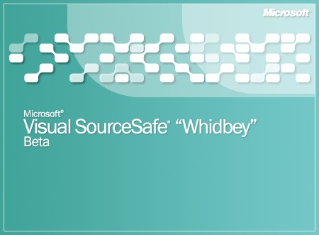
I'll second Eric on this and also add that the pattern used in logo 67 seems to be used even more in VS2005 beta (e.g. the major visual element in the Visual SourceSafe splash screen is that pattern). Stuart Dootson

I'll second Eric on this and also add that the pattern used in logo 67 seems to be used even more in VS2005 beta (e.g. the major visual element in the Visual SourceSafe splash screen is that pattern).
Could you pls. send screenshot? -- Bronek Kozicki brok@rubikon.pl http://b.kozicki.pl/
On Wed, 9 Mar 2005 10:10:26 +0000, Bronek Kozicki <b.kozicki@gmail.com> wrote:
I'll second Eric on this and also add that the pattern used in logo 67 seems to be used even more in VS2005 beta (e.g. the major visual element in the Visual SourceSafe splash screen is that pattern).
Could you pls. send screenshot?
-- Bronek Kozicki brok@rubikon.pl http://b.kozicki.pl/
I've attached a jpg file - it's not completely the same as logo 67, but quite close. Stuart Dootson
Stuart Dootson <stuart.dootson@gmail.com> writes:
On Wed, 09 Mar 2005 00:31:45 -0800, Eric Niebler <eric@boost-consulting.com> wrote:
When I look at logo 67, I have *strong* associations with Microsoft's developer tools.
-- Eric Niebler Boost Consulting www.boost-consulting.com
I'll second Eric on this and also add that the pattern used in logo 67 seems to be used even more in VS2005 beta (e.g. the major visual element in the Visual SourceSafe splash screen is that pattern).
Drat. That's discouraging. -- Dave Abrahams Boost Consulting www.boost-consulting.com

-----Original Message----- From: boost-bounces@lists.boost.org [mailto:boost-bounces@lists.boost.org] On Behalf Of David Abrahams Sent: Tuesday, March 08, 2005 9:16 PM To: boost@lists.boost.org Subject: [boost] Re: Logo 67 bad [was: Logo comments]
"Jonathan Turkanis" <technews@kangaroologic.com> writes:
David Abrahams wrote:
"Eric Niebler" <eric@boost-consulting.com> writes:
A lot of people are expressing favorable opinions about selection 67 boost/squares. This logo is simply out of the question, in my opinion, because of its glaring similarity to the marketing imagery of Visual Studio. Just look at the Visual C++ box:
http://www.microsoft.com/presspass/images/gallery/boxshots/web/visual-
c-plus-plus03.jpg
IMO, option 67 should be removed.
I consider that a background pattern and not sacrosanct. I never would have noticed it had you not pointed it out.
I think if we had to eliminate any abstract graphic that was used in promotional or packaging material, there'd be hardly anything we could use.
If it was used on the packaging of baby formula I might agree with you. Having a logo that's so similar to to VC++ marketing material would be a real problem, IMO.
Even though it's just a minor design element in the VC++ package?
One question: is anyone doing trademark searches for similar logos? In the US, any University library, and probably lots of other sources, have the listings for free examination, current to about three months. Of course, they're not indexed any too well... Reid
David Abrahams <dave@boost-consulting.com> writes:
"Eric Niebler" <eric@boost-consulting.com> writes:
A lot of people are expressing favorable opinions about selection 67 boost/squares. This logo is simply out of the question, in my opinion, because of its glaring similarity to the marketing imagery of Visual Studio. Just look at the Visual C++ box:
http://tinyurl.com/6chhn http://www.microsoft.com/presspass/images/gallery/boxshots/web/visual-c-plus...
IMO, option 67 should be removed.
I consider that a background pattern and not sacrosanct. I never would have noticed it had you not pointed it out.
I think if we had to eliminate any abstract graphic that was used in promotional or packaging material, there'd be hardly anything we could use.
I meant to say "if we had to eliminate any abstract graphic that was similar to something used in promotional or packaging material..." -- Dave Abrahams Boost Consulting www.boost-consulting.com
-----Original Message----- From: boost-bounces@lists.boost.org [mailto:boost-bounces@lists.boost.org] On Behalf Of David Abrahams Sent: Tuesday, March 08, 2005 8:33 PM To: boost@lists.boost.org Subject: [boost] Re: Logo 67 bad [was: Logo comments]
"Eric Niebler" <eric@boost-consulting.com> writes:
A lot of people are expressing favorable opinions about selection 67 boost/squares. This logo is simply out of the question, in my opinion, because of its glaring similarity to the marketing imagery of Visual Studio. Just look at the Visual C++ box:
http://www.microsoft.com/presspass/images/gallery/boxshots/web/visual-
c-plus-plus03.jpg
IMO, option 67 should be removed.
I consider that a background pattern and not sacrosanct. I never would have noticed it had you not pointed it out.
I think if we had to eliminate any abstract graphic that was used in promotional or packaging material, there'd be hardly anything we could use.
True, but MS is notoriously litigious, and, well, I assume you know of the case where IBM sued someone for doing a logo in block blue letters? Won too (big surprise). Some years ago. Reid
"Reid Sweatman" <drunkardswalk@earthlink.net> writes:
"Eric Niebler" <eric@boost-consulting.com> writes:
IMO, option 67 should be removed.
I consider that a background pattern and not sacrosanct. I never would have noticed it had you not pointed it out.
I think if we had to eliminate any abstract graphic that was used in promotional or packaging material, there'd be hardly anything we could use.
True, but MS is notoriously litigious, and, well, I assume you know of the case where IBM sued someone for doing a logo in block blue letters? Won too (big surprise). Some years ago.
Yeah, I've been convinced it's a problem since at least yesterday. :( -- Dave Abrahams Boost Consulting www.boost-consulting.com
-----Original Message----- From: boost-bounces@lists.boost.org [mailto:boost-bounces@lists.boost.org] On Behalf Of David Abrahams Sent: Wednesday, March 09, 2005 6:24 PM To: boost@lists.boost.org Subject: [boost] Re: Logo 67 bad [was: Logo comments]
"Reid Sweatman" <drunkardswalk@earthlink.net> writes:
"Eric Niebler" <eric@boost-consulting.com> writes:
IMO, option 67 should be removed.
I consider that a background pattern and not sacrosanct. I never would have noticed it had you not pointed it out.
I think if we had to eliminate any abstract graphic that
was used in
promotional or packaging material, there'd be hardly anything we could use.
True, but MS is notoriously litigious, and, well, I assume you know of the case where IBM sued someone for doing a logo in block blue letters? Won too (big surprise). Some years ago.
Yeah, I've been convinced it's a problem since at least yesterday. :(
It might be salvable, though. I liked it a lot, just thought it too close. Got to looking more closely and noticed that you can (if you really want to <g>) see the cubes on and above the main diagonal as a spaceship, and the remaining cube as its exhaust. Were you to shift the "wing" cubes in the direction of the anti-diagonal (i.e., southwest <g>), maybe curve their links with the center, it might remain appealing and lose that unfortunate resemblance. It also kind of looks like Batman. (No, I don't have a comic stuffed into my copy of "C++ Template Metaprogramming" <g>). Could also just rotate it 45 degrees widdershins. That would probably also mess up the resemblance, although it also messes up the nice asymmetry of the original. Could also change the "flame" cube to a triangle by eliminating the half closest to the "ship." Just suggestions. It's the flu meds, y'know? I'm a zombie right now. But it would have been my first choice, too; ought to be some way to rework it while keeping the essence. Reid
Reid Sweatman wrote:
It might be salvable, though. I liked it a lot, just thought it too close. Got to looking more closely and noticed that you can (if you really want to <g>) see the cubes on and above the main diagonal as a spaceship, and the remaining cube as its exhaust. Were you to shift the "wing" cubes in the direction of the anti-diagonal (i.e., southwest <g>), maybe curve their links with the center, it might remain appealing and lose that unfortunate resemblance. It also kind of looks like Batman. (No, I don't have a comic stuffed into my copy of "C++ Template Metaprogramming" <g>). Could also just rotate it 45 degrees widdershins. That would probably also mess up the resemblance, although it also messes up the nice asymmetry of the original. Could also change the "flame" cube to a triangle by eliminating the half closest to the "ship." Just suggestions. It's the flu meds, y'know? I'm a zombie right now.
It would be easier to follow if you would post some examples.
But it would have been my first choice, too; ought to be some way to rework it while keeping the essence.
Unfortunately, the contest is closed now. I don't think we can open up one of the logos for major redesign without doing it for the others. Jonathan
"Jonathan Turkanis" <technews@kangaroologic.com> writes:
Reid Sweatman wrote:
It might be salvable, though. I liked it a lot, just thought it too close. Got to looking more closely and noticed that you can (if you really want to <g>) see the cubes on and above the main diagonal as a spaceship, and the remaining cube as its exhaust. Were you to shift the "wing" cubes in the direction of the anti-diagonal (i.e., southwest <g>), maybe curve their links with the center, it might remain appealing and lose that unfortunate resemblance. It also kind of looks like Batman. (No, I don't have a comic stuffed into my copy of "C++ Template Metaprogramming" <g>). Could also just rotate it 45 degrees widdershins. That would probably also mess up the resemblance, although it also messes up the nice asymmetry of the original. Could also change the "flame" cube to a triangle by eliminating the half closest to the "ship." Just suggestions. It's the flu meds, y'know? I'm a zombie right now.
It would be easier to follow if you would post some examples.
But it would have been my first choice, too; ought to be some way to rework it while keeping the essence.
Unfortunately, the contest is closed now. I don't think we can open up one of the logos for major redesign without doing it for the others.
Maybe we should do that. We've learned a lot since this started. We can always give an extra award to cover our learning experience if any logo designers would feel cheated. -- Dave Abrahams Boost Consulting www.boost-consulting.com
David Abrahams wrote:
"Jonathan Turkanis" writes:
Reid Sweatman wrote:
But it would have been my first choice, too; ought to be some way to rework it while keeping the essence.
Unfortunately, the contest is closed now. I don't think we can open up one of the logos for major redesign without doing it for the others.
Maybe we should do that. We've learned a lot since this started.
This would be fine with me. Jonathan

"Jonathan Turkanis" <technews@kangaroologic.com> wrote in message news:d0oki6$v17$1@sea.gmane.org...
David Abrahams wrote:
"Jonathan Turkanis" writes:
Reid Sweatman wrote:
But it would have been my first choice, too; ought to be some way to rework it while keeping the essence.
Unfortunately, the contest is closed now. I don't think we can open up one of the logos for major redesign without doing it for the others.
Maybe we should do that. We've learned a lot since this started.
This would be fine with me.
I don't have a clear winner(s) either. None of the submission as it is wouldn't be acceptable IMO. I also support second round. Couple notes in this regard: 1. We need to specify our hmm.. priorities/criteria's in a some written form on logo contest page. We could update this list based on discussions and apply them to existing submissions to eliminate failing submission from further discussion. 2. We should continue discussion. No need to wait for "voting" stage to express opinions on submission. If there is a consensus that submission is unacceptable we could eliminate it from further discussion. 3. I don't think there is any way to "intelligently" select from 100 or so submissions. We need to bring this to top 5-10 and employ any formal voting only after that 4. Each submission should consist of: a) primary variation(s) b) secondary variations (we could specify which color combinations of colors/ slogans to use) c) icon variation d) example page with this logo applied to both header and body I don't think we are in a hurry to jump to something that is just better that current one. May be we could find one that at least acceptable by majority. Gennadiy

I've refrained from commenting on logo things, as I'm one of the contestants :-) But can't help myself on this one.. Gennadiy Rozental wrote:
3. I don't think there is any way to "intelligently" select from 100 or so submissions. We need to bring this to top 5-10 and employ any formal voting only after that
That is a wonderful idea! Such elimination is exactly what is done by clients and design companies. They narrow the field of concepts which helps them to think more clearly about the logos. -- -- Grafik - Don't Assume Anything -- Redshift Software, Inc. - http://redshift-software.com -- rrivera/acm.org - grafik/redshift-software.com - 102708583/icq
Rene Rivera <grafik.list@redshift-software.com> writes:
I've refrained from commenting on logo things, as I'm one of the contestants :-) But can't help myself on this one..
Gennadiy Rozental wrote:
3. I don't think there is any way to "intelligently" select from 100 or so submissions. We need to bring this to top 5-10 and employ any formal voting only after that
That is a wonderful idea! Such elimination is exactly what is done by clients and design companies. They narrow the field of concepts which helps them to think more clearly about the logos.
Speaking of which, I wonder how much professional logo design costs? I might be inclined to fund it -- or find funding for it. -- Dave Abrahams Boost Consulting www.boost-consulting.com

David Abrahams wrote:
[...] Speaking of which, I wonder how much professional logo design costs? I might be inclined to fund it -- or find funding for it.
Bargain basement logos start around $500 for a half-respectable design house. Depends on exact terms and conditions (like ownership, etc.), but expect it to go up quickly from that. What would be nicer is if a few design shops entered the contest and provided a logo pro bono, or were willing to do some type of trade for services. Dave
"David B. Held" <dheld@codelogicconsulting.com> writes:
David Abrahams wrote:
[...] Speaking of which, I wonder how much professional logo design costs? I might be inclined to fund it -- or find funding for it.
Bargain basement logos start around $500 for a half-respectable design house. Depends on exact terms and conditions (like ownership, etc.), but expect it to go up quickly from that. What would be nicer is if a few design shops entered the contest and provided a logo pro bono, or were willing to do some type of trade for services.
Yep, pro bono would be good. -- Dave Abrahams Boost Consulting www.boost-consulting.com
From: Rene Rivera <grafik.list@redshift-software.com>
Gennadiy Rozental wrote:
3. I don't think there is any way to "intelligently" select from 100 or so submissions. We need to bring this to top 5-10 and employ any formal voting only after that
That is a wonderful idea! Such elimination is exactly what is done by clients and design companies. They narrow the field of concepts which helps them to think more clearly about the logos.
That is precisely what I did. I selected those logos for which I had some liking and linked them in an HTML page. I also created smaller versions (just specified height in the IMG tag) so I could see them as icons in some form. Then, I culled the list until only five remained.
From that point, I had only to order them and submit my vote.
-- Rob Stewart stewart@sig.com Software Engineer http://www.sig.com Susquehanna International Group, LLP using std::disclaimer;
From: David Abrahams <dave@boost-consulting.com>
"Jonathan Turkanis" <technews@kangaroologic.com> writes:
Reid Sweatman wrote:
It might be salvable, though. I liked it a lot, just thought it too close. Got to looking more closely and noticed that you can (if you [snip] eliminating the half closest to the "ship." Just suggestions. It's the flu meds, y'know? I'm a zombie right now.
It would be easier to follow if you would post some examples.
Most definitely. That also doesn't fit the minor alterations theme I proposed.
But it would have been my first choice, too; ought to be some way to rework it while keeping the essence.
Unfortunately, the contest is closed now. I don't think we can open up one of the logos for major redesign without doing it for the others.
Maybe we should do that. We've learned a lot since this started.
Since most of the submitters aren't graphic artists, they have learned a lot from the discussion, too. I'd really like to see a number of the logos reworked.
We can always give an extra award to cover our learning experience if any logo designers would feel cheated.
Do you mean forcibly select the best from the current crop plus start a new round to select the real logo? I guess that would work. -- Rob Stewart stewart@sig.com Software Engineer http://www.sig.com Susquehanna International Group, LLP using std::disclaimer;

(list lurker responding)
67 - This is clearly one of the best logos.
Speaking of associations - when I saw this I first thought of Cingular's logo <http://www.cingular.com>, which seems like a bad thing. -- Trey Jackson tjackson@ichips.intel.com Yesterday it worked. Today it is not working. Windows is like that.

On Tue, 08 Mar 2005 17:17:26 -0800, Trey Jackson wrote
(list lurker responding)
67 - This is clearly one of the best logos.
Speaking of associations - when I saw this I first thought of Cingular's logo <http://www.cingular.com>, which seems like a bad thing.
That was my reaction as well -- sadly it appears that their advertising has somehow made it thru my thick head :-( My favorite was #20 -- I like the subtle way C++ comes out of the ST -- since Dave doesn't like that one it appears we have different taste in logos. Jeff
Trey Jackson wrote:
(list lurker responding)
67 - This is clearly one of the best logos.
Speaking of associations - when I saw this I first thought of Cingular's logo <http://www.cingular.com>, which seems like a bad thing.
Me too. When I first saw it, I told my wife it reminded me of an existing logo, but I couldn't think of which one. She said "Purina" (http://www.purina.com/). Later I figured out I was probably thinking of cingular. On reflection, I decided that the logos really weren't that similar; I'm a bit worried that the similarity also occurred to someone else. Jonathan
"Jonathan Turkanis" <technews@kangaroologic.com> writes:
Trey Jackson wrote:
(list lurker responding)
67 - This is clearly one of the best logos.
Speaking of associations - when I saw this I first thought of Cingular's logo <http://www.cingular.com>, which seems like a bad thing.
Me too. When I first saw it, I told my wife it reminded me of an existing logo,
I had the same reaction, but I think it's just similar to a few things and has "that logo look" about it.
but I couldn't think of which one. She said "Purina" (http://www.purina.com/). Later I figured out I was probably thinking of cingular.
On reflection, I decided that the logos really weren't that similar; I'm a bit worried that the similarity also occurred to someone else.
Yeah, that's three people now. I wasn't worried before, but now I am slightly concerned. -- Dave Abrahams Boost Consulting www.boost-consulting.com
67 - This is clearly one of the best logos.
Speaking of associations - when I saw this I first thought of Cingular's logo <http://www.cingular.com>, which seems like a bad thing.
Me too. When I first saw it, I told my wife it reminded me of an existing logo,
I had the same reaction, but I think it's just similar to a few things and has "that logo look" about it.
but I couldn't think of which one. She said "Purina" (http://www.purina.com/). Later I figured out I was probably thinking of cingular.
On reflection, I decided that the logos really weren't that similar; I'm a bit worried that the similarity also occurred to someone else.
Yeah, that's three people now. I wasn't worried before, but now I am slightly concerned.
I had very similar reaction. Just wanted to find first what it look like. Gennadiy
-----Original Message----- From: boost-bounces@lists.boost.org [mailto:boost-bounces@lists.boost.org] On Behalf Of David Abrahams Sent: Tuesday, March 08, 2005 8:31 PM To: boost@lists.boost.org Subject: [boost] Re: Logo comments
"Jonathan Turkanis" <technews@kangaroologic.com> writes:
Trey Jackson wrote:
(list lurker responding)
67 - This is clearly one of the best logos.
Speaking of associations - when I saw this I first thought of Cingular's logo <http://www.cingular.com>, which seems like a bad thing.
Me too. When I first saw it, I told my wife it reminded me of an existing logo,
I had the same reaction, but I think it's just similar to a few things and has "that logo look" about it.
but I couldn't think of which one. She said "Purina" (http://www.purina.com/). Later I figured out I was probably thinking of cingular.
On reflection, I decided that the logos really weren't that similar; I'm a bit worried that the similarity also occurred to someone else.
Yeah, that's three people now. I wasn't worried before, but now I am slightly concerned.
Pop me on that stack. Noticed it immediately. My wife, who does web branding for "one of the big boys" (better leave it at that) was looking over my shoulder. Her comment: "That one's a lawsuit waiting to happen." Reid
Jonathan Turkanis writes:
92 - The captions "Plug it in", "Pieces that fit," etc. make the logos look cluttered; otherwise they look pretty good. However, I don't buy the explanation that the logo "at first appears to be a jigsaw puzzle piece" but can also be seen as people talking around a table:
- no one will know that this is the intended interpretation unless they are told. Even if someone notices the alternate interpretation, there's no clue that this is intended
What's the clue in case of the FedEx's arrow?
- the logo will *always* appear to be a puzzle piece; at best it will *also* appear to be people sitting around a table.
Sure.
The problem with this is that "finding a piece of the puzzle" is one of the most overworked metaphors in English. (I don't know if this is true in other languages.)
It's not the metaphors of the logo, though. The puzzle piece is simply a symbolic representation of a pluggable software component. If that sounds plain, then it's a symbolic representation of a pluggable software component born in discussions at the table that is also the component itself ;). -- Aleksey Gurtovoy MetaCommunications Engineering
Aleksey, Let me reiterate that I meant no offense by by comments; in fact, I found it to be one of the better logos (if the slogans were removed). Aleksey Gurtovoy wrote:
Jonathan Turkanis writes:
92 - The captions "Plug it in", "Pieces that fit," etc. make the logos look cluttered; otherwise they look pretty good. However, I don't buy the explanation that the logo "at first appears to be a jigsaw puzzle piece" but can also be seen as people talking around a table:
- no one will know that this is the intended interpretation unless they are told. Even if someone notices the alternate interpretation, there's no clue that this is intended
What's the clue in case of the FedEx's arrow?
I guess your point is the logo is okay even if it only appears to be a puzzle piece? I've no problem with that; I just meant to point out that the secondary association you describe won't have much effect on people viewing the logo in isolation.
- the logo will *always* appear to be a puzzle piece; at best it will *also* appear to be people sitting around a table.
Sure.
The problem with this is that "finding a piece of the puzzle" is one of the most overworked metaphors in English. (I don't know if this is true in other languages.)
It's not the metaphors of the logo, though. The puzzle piece is simply a symbolic representation of a pluggable software component.
Unfortunately, "finding a piece of the puzzle" (to me) has the stronger association with puzzle pieces. The other explanation, which is perfectly reasonable, has to be explained. I guess that was the point of the slogans which I didn't like.
If that sounds plain, then it's a symbolic representation of a pluggable software component born in discussions at the table that is also the component itself ;).
Jonathan

Jonathan Turkanis wrote:
Hi All,
Here are my remarks about some of the logo candidates.
[...]
C) the letters "C++" and the scope resolution operator "::" simply aren't very visually appealing.
I don't think so. For one, (not that this counts ;) ) my favorites are the logos 20 43 and 39 (38 not so much) All of them could improve a bit, e.g. #20 should be recolored, take a real blue instead of the "baby blue" , strong bordeaux red instead of "dirty pink" and have a bit more contrast in the white parts. In #43 the dots in "::" should be round, that would be more appealing. It would be also possible to change #43 to read "boost<c++>" (like #25) Because "boost<c++>" IMHO tells every c++ programmer exactly what boost does (even how it does it.) Further it would work in Text only browsers, too and it could be reused for other language bindings, e.g. "boost<phyton>" What I like about either "::", "++" and "< >" is that one imediately thinks of c++. Fabio
Fabio Fracassi wrote:
Jonathan Turkanis wrote:
Hi All,
Here are my remarks about some of the logo candidates.
[...]
C) the letters "C++" and the scope resolution operator "::" simply aren't very visually appealing.
I don't think so. For one, (not that this counts ;) ) my favorites are the logos 20
Hmmm... that's one of mine ;-) I guess I overstated my case :-)
43 and 39 (38 not so much)
All of them could improve a bit, e.g. #20 should be recolored, take a real blue instead of the "baby blue" , strong bordeaux red instead of "dirty pink" and have a bit more contrast in the white parts.
These color changes are easy, of course. I think the blue looks okay; I see what you mean about the red. Jonathan
participants (14)
-
 Aleksey Gurtovoy
 -
 Bronek Kozicki
 -
 David Abrahams
 -
 David B. Held
 -
 Eric Niebler
 -
 Fabio Fracassi
 -
 Gennadiy Rozental
 -
 Jeff Garland
 -
 Jonathan Turkanis
 -
 Reid Sweatman
 -
 Rene Rivera
 -
 Rob Stewart
 -
 Stuart Dootson
 -
 Trey Jackson