Front page... with new logo.

http://redshift-software.com/~grafik/boost/index.htm Boost C++ Libraries Hopefully all the bugs are worked out at this point :-) About the logo... In keeping with the style it's simple; it's only based on text outlines. Components are: * Solid "Boost" with surrounding template "<>" in outline form. * The slight perspective shadow of that, with the "{C++}" as part of the shadow. The hope is to invoke STL, templates, libraries, and C++. The "<Boost>" part can be any color, and should be adjusted to fit the background it's over and the context. The shadow part should be kept in a dark color (it's black right now). And it should be easy enough to make a vector version.. Just need to crank up an SVG editor :-) -- -- Grafik - Don't Assume Anything -- Redshift Software, Inc. - http://redshift-software.com -- rrivera/acm.org - grafik/redshift-software.com - 102708583/icq

Take the left bar from your last (pink) one, make the border blue, and use the content from this one. On Sat, 20 Nov 2004 22:02:26 -0600, Rene Rivera <grafik.list@redshift-software.com> wrote:
http://redshift-software.com/~grafik/boost/index.htm Boost C++ Libraries
Hopefully all the bugs are worked out at this point :-)
About the logo... In keeping with the style it's simple; it's only based on text outlines. Components are:
* Solid "Boost" with surrounding template "<>" in outline form. * The slight perspective shadow of that, with the "{C++}" as part of the shadow.
The hope is to invoke STL, templates, libraries, and C++. The "<Boost>" part can be any color, and should be adjusted to fit the background it's over and the context. The shadow part should be kept in a dark color (it's black right now).
And it should be easy enough to make a vector version.. Just need to crank up an SVG editor :-)
-- -- Grafik - Don't Assume Anything -- Redshift Software, Inc. - http://redshift-software.com -- rrivera/acm.org - grafik/redshift-software.com - 102708583/icq
_______________________________________________ Unsubscribe & other changes: http://lists.boost.org/mailman/listinfo.cgi/boost
-- Cory Nelson http://www.int64.org

Rene Rivera <grafik.list@redshift-software.com> writes:
http://redshift-software.com/~grafik/boost/index.htm Boost C++ Libraries
Hopefully all the bugs are worked out at this point :-)
The problem is that nothing can definitely be called a bug. This is a highly subjective process and different ideas will work for different people. Thank you for adjusting the text size; it really does look much better in my extremely common browser.
About the logo... In keeping with the style it's simple;
I know you put a great deal of effort into this, but IMO it's too complicated. Even though the first one was indeed too Borland-like, as a logo it functioned much better: it was simple, recognizable, and impactful. I also think the left column has become too complicated. I do like the dark background, but the dotted lines seem to have multiplied. Compare with http://luabind.sourceforge.net/boost.png. The light, colored section headers don't speak as clearly as those in http://luabind.sourceforge.net/boost.png (I prefer black but can live with dark blue -- we chose black for the new Boost docs stylesheet), and putting them below the dotted line seems "needlessly innovative." I understand that there may be some logic in it, but people are used to seeing Name of Section XX ......................................................... The dashed line acts like an underline, which is logical, and is reminiscent of a table of contents.
it's only based on text outlines. Components are:
* Solid "Boost" with surrounding template "<>" in outline form.
There is no obvious reason to me that the surrounding "<>" ought to have a different style from the "Boost" it contains. A similar argument goes for "{C++}". It's also not obvious that those are meant to be template brackets; they could be #include brackets.
* The slight perspective shadow of that, with the "{C++}" as part of the shadow.
The hope is to invoke STL, templates, libraries, and C++.
IMO it's trying too hard. My advice: don't try to evoke so many things. Say one thing and say it clearly. One idea that we might start with is enclosed What that's meant to evoke should be pretty obvious ;-) -- Dave Abrahams Boost Consulting http://www.boost-consulting.com

From: David Abrahams <dave@boost-consulting.com>
Rene Rivera <grafik.list@redshift-software.com> writes:
About the logo... In keeping with the style it's simple;
I know you put a great deal of effort into this, but IMO it's too complicated. Even though the first one was indeed too Borland-like, as a logo it functioned much better: it was simple, recognizable, and impactful. [snip] There is no obvious reason to me that the surrounding "<>" ought to have a different style from the "Boost" it contains. A similar argument goes for "{C++}". It's also not obvious that those are meant to be template brackets; they could be #include brackets.
* The slight perspective shadow of that, with the "{C++}" as part of the shadow.
The hope is to invoke STL, templates, libraries, and C++.
IMO it's trying too hard. My advice: don't try to evoke so many things. Say one thing and say it clearly.
One idea that we might start with is enclosed
Shouldn't "Boost" be elevating "C++" rather than pushing it down as depicted in your logo? IOW, giving C++ a boost should look more like this: C++ Boost Maybe use exponentiation? Boost C++ The suggested rocket idea is good too: ^ / \ / \ / \ | C++ | |_____| | B | | O | | O | | S | | T | |_____| /\ /\ (Obviously, you'd want something a little more impressive than my ASCII art.) -- Rob Stewart stewart@sig.com Software Engineer http://www.sig.com Susquehanna International Group, LLP using std::disclaimer;

At 11:02 PM 11/20/2004, Rene Rivera wrote:
http://redshift-software.com/~grafik/boost/index.htm Boost C++ Libraries
Hopefully all the bugs are worked out at this point :-)
About the logo... In keeping with the style it's simple; it's only based on text outlines. Components are:
* Solid "Boost" with surrounding template "<>" in outline form. * The slight perspective shadow of that, with the "{C++}" as part of the shadow.
The hope is to invoke STL, templates, libraries, and C++. The "<Boost>" part can be any color, and should be adjusted to fit the background it's over and the context. The shadow part should be kept in a dark color (it's black right now).
On my notebook LCD screen the black C++ is getting lost against the blue background. OTOH, the < and > look really sharp. Have you tried the {C++} using the same outline font as < and >? --Beman

"Rene Rivera" <grafik.list@redshift-software.com> wrote in message news:41A01352.4060104@redshift-software.com...
http://redshift-software.com/~grafik/boost/index.htm Boost C++ Libraries
Hopefully all the bugs are worked out at this point :-)
About the logo... In keeping with the style it's simple; it's only based on text outlines. Components are:
* Solid "Boost" with surrounding template "<>" in outline form. * The slight perspective shadow of that, with the "{C++}" as part of the shadow.
The hope is to invoke STL, templates, libraries, and C++. The "<Boost>" part can be any color, and should be adjusted to fit the background it's over and the context. The shadow part should be kept in a dark color (it's black right now).
And it should be easy enough to make a vector version.. Just need to crank up an SVG editor :-)
I just see a blue rectangle in the place of the logo on both Internet Explorer 6 (sp2) and Opera 7.53 Regards Gustavo Guerra
--
-- Grafik - Don't Assume Anything -- Redshift Software, Inc. - http://redshift-software.com -- rrivera/acm.org - grafik/redshift-software.com - 102708583/icq
_______________________________________________ Unsubscribe & other changes: http://lists.boost.org/mailman/listinfo.cgi/boost
Gustavo Guerra wrote:
I just see a blue rectangle in the place of the logo on both Internet Explorer 6 (sp2) and Opera 7.53
I removed it from the page, so that the logo could be worked one separately without the influence of the page design. It makes a difference to the logo design, although not to the page design. That original one is attached... -- -- Grafik - Don't Assume Anything -- Redshift Software, Inc. - http://redshift-software.com -- rrivera/acm.org - grafik/redshift-software.com - 102708583/icq
From: Rene Rivera <grafik.list@redshift-software.com>
I just see a blue rectangle in the place of the logo on both Internet Explorer 6 (sp2) and Opera 7.53
I removed it from the page, so that the logo could be worked one separately without the influence of the page design. It makes a difference to the logo design, although not to the page design.
That original one is attached...
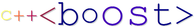
How about something based upon this: C++<boost> (I know it isn't valid C++ syntax, but doesn't it suggest parameterizing C++ with Boost, thus configuring C++ and, by implication, making it better?) -- Rob Stewart stewart@sig.com Software Engineer http://www.sig.com Susquehanna International Group, LLP using std::disclaimer;
Rob Stewart wrote:
From: Rene Rivera <grafik.list@redshift-software.com>
I just see a blue rectangle in the place of the logo on both Internet Explorer 6 (sp2) and Opera 7.53
I removed it from the page, so that the logo could be worked one separately without the influence of the page design. It makes a difference to the logo design, although not to the page design.
That original one is attached...
How about something based upon this: C++<boost>
Too many little glyphs IMO. "++" is about all my eyes can handle without getting "<>" involved. -- Dave Abrahams Boost Consulting http://www.boost-consulting.com

On Tue, 30 Nov 2004 12:28:44 -0500 (EST), Rob Stewart <stewart@sig.com> wrote: How about something based upon this: C++<boost>
(I know it isn't valid C++ syntax, but doesn't it suggest parameterizing C++ with Boost, thus configuring C++ and, by implication, making it better?)
I quite like that idea. Perhaps emphasise the os in boost for the dual connotations of open source and operating system. bit of colour for a rocket. can type it as text. what about a font style similar to some one else's suggestion with a bit of shadow... could do with a better font / shading. $AUD 0.005, matt hurd. matthurd@acm.org

On Wed, 1 Dec 2004 12:08:44 +1100, Matt Hurd <matt.hurd@gmail.com> wrote:
I quite like that idea. Perhaps emphasise the os in boost for the dual connotations of open source and operating system. bit of colour for a rocket. can type it as text.
what about a font style similar to some one else's suggestion with a bit of shadow...
Too many colors and the oddball foNT siZinG looks horrible. Yes Boost is open source, but highlighting "OS" further confuses an already confusing set of glyphs. -- Caleb Epstein caleb dot epstein at gmail dot com
Caleb Epstein wrote:
On Wed, 1 Dec 2004 12:08:44 +1100, Matt Hurd <matt.hurd@gmail.com> wrote:
I quite like that idea. Perhaps emphasise the os in boost for the dual connotations of open source and operating system. bit of colour for a rocket. can type it as text.
what about a font style similar to some one else's suggestion with a bit of shadow...
Too many colors and the oddball foNT siZinG looks horrible. Yes Boost is open source, but highlighting "OS" further confuses an already confusing set of glyphs.
Besides all that, which I agree with, courier is a hard font to make work in this context. It's too skinny. You can do a little better (but not much) by boldifying it. And the fact that it's monospace makes most logos using it look too wide (especially something as long as this one). -- Dave Abrahams Boost Consulting http://www.boost-consulting.com
On Wed, 01 Dec 2004 07:23:35 -0500, David Abrahams <dave@boost-consulting.com> wrote:
Caleb Epstein wrote:
On Wed, 1 Dec 2004 12:08:44 +1100, Matt Hurd <matt.hurd@gmail.com> wrote:
I quite like that idea. Perhaps emphasise the os in boost for the dual connotations of open source and operating system. bit of colour for a rocket. can type it as text.
what about a font style similar to some one else's suggestion with a bit of shadow...
Too many colors and the oddball foNT siZinG looks horrible. Yes Boost is open source, but highlighting "OS" further confuses an already confusing set of glyphs.
Besides all that, which I agree with, courier is a hard font to make work in this context. It's too skinny. You can do a little better (but not much) by boldifying it. And the fact that it's monospace makes most logos using it look too wide (especially something as long as this one).
-- Dave Abrahams Boost Consulting http://www.boost-consulting.com
Yeah, I don't think it works... This was a serif font with the OS back in its normality box. matt.


Rene Rivera wrote:
I like the latest version because it's clean yet elegant in a way that improves upon the current site. Instead of going ultra-geek with the logo, I really like the rocket suggestion. Perhaps someone with some artistic flair could make us a nice rocket logo? A minor nit is that I think the menu should say: "Mailing Lists and Newsgroups" [note the capitalization] I also agree with another poster that the search seems a little awkward right in the middle of the page. To be honest, when I go to the Boost site, most of the time, I'm looking for documentation. So if anything, I'd like to see a big obvious section with a link to the docs on the main column, but I don't know if anyone else feels that way. The search would be nice as a little sidebar or topbar type thingy. The other thing that I think is inappropriate about the search is that there are really many places where you can and need to search to find Boost-related material. Sometimes I like to search GMANE, and sometimes I have to go to ASPN still to get really old messages. So if we are going to link to search, it seems that all of those options should be available in the same area. Dave
participants (10)
-
 Beman Dawes
 -
 Caleb Epstein
 -
 Cory Nelson
 -
 David Abrahams
 -
 David B. Held
 -
 Gustavo Guerra
 -
 Matt Hurd
 -
 Rene Rivera
 -
 Rob Stewart
 -
 Russell Hind