
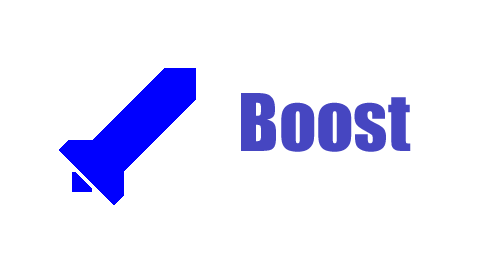
This should give some idea as to what I think of as a "scalable logo" or a "scale-free logo". It's rather crude yes, but that's partly the point. Instead of rendering the word "Boost" in a nice font of the same or some appropriate color, I shamelessly stole one from another logo. The colors aren't really important, because they aren't the point (a graphic artist could pick much better colors). I don't know if rounded edges are better or straight lines. And perhaps even this example has more angles than I like in a scale-free logo. Perhaps we could even do without the fins, I'm not sure. The angles could be adjusted to be more pleasing. Now some might say: "Well, Rene made an abstract looking rocket too." And that is true. But Rene's rocket has some very subtle features, like the edges near the flames, which is an area of "high entropy" so to speak. My rocket has no detail frills, and could easily be compressed to an absurdly small vector file. Perhaps something with a nonnegative amount of artistic talent could play with the idea a bit without adding too much information to the logo. I realize that the contest is closed, but I'd like to explore a more simplistic direction just to get an idea of some areas of the design space that I don't think have been hit very heavily. I don't intend the word "Boost" to be a necessary part of the logo. I just think that in large-scale contexts, a caption would be nice, whether it be on the side or the bottom or a word or a phrase. Any takers? Dave